Bolt SuperApp
Turning a chaotic proof of concept into a real product foundation. Something investors could trust. Something users could understand. Something the company could actually grow.
Client
Bolt
Role
Lead UX Designer
Responsibilities
Research, Product Design, Design Systems
Overview01
About Bolt
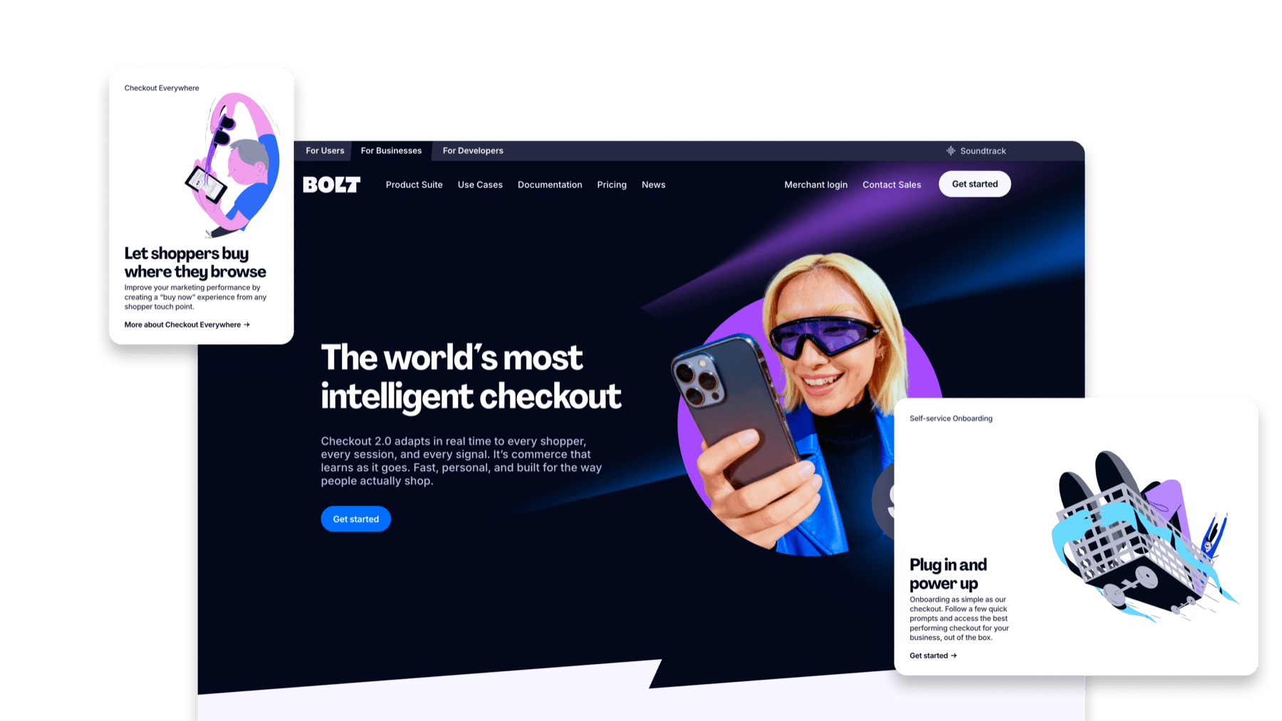
Bolt is a fintech company that built its reputation on a single, successful product: Checkout. It was focused, effective, and it worked. But at some point, the CEO set his sights on something much bigger.
CEO's new toy: SuperApp
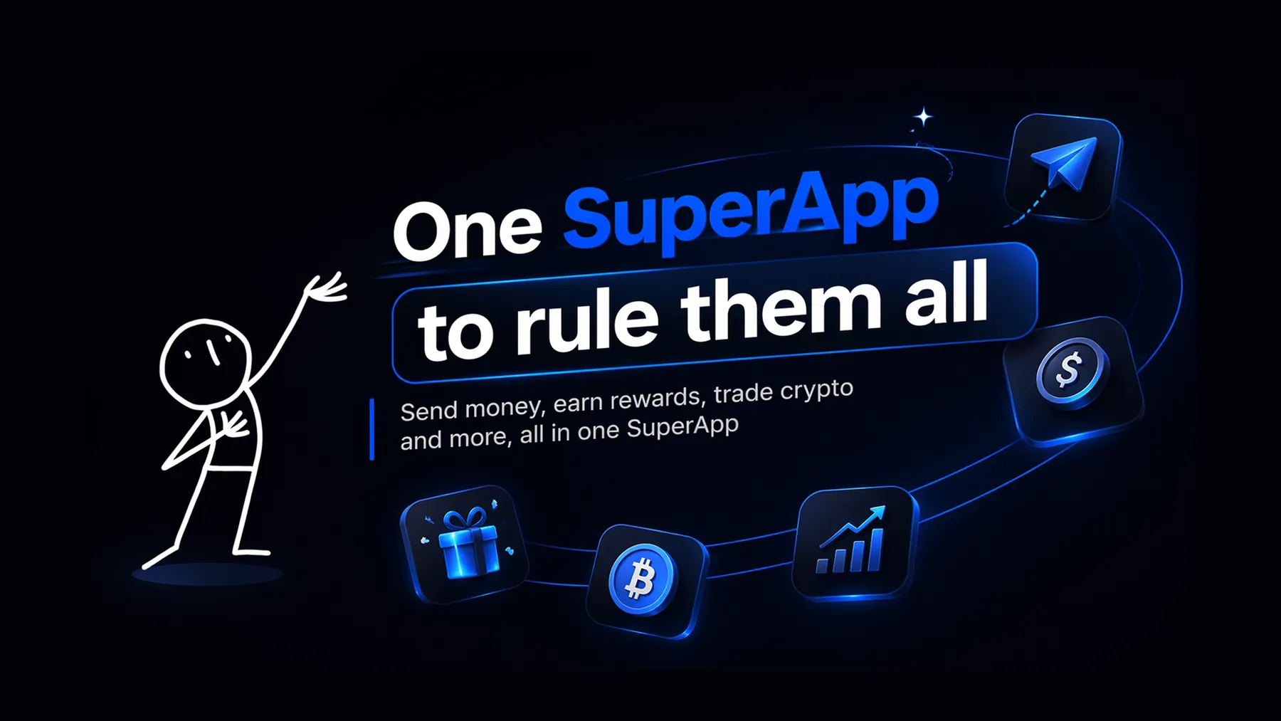
The vision was bold. One app for everything. Banking, crypto, shopping, investing, insurance, games, all living under one roof. The strategy was simple and unapologetically aggressive: pack the app with as many features as possible, launch fast, and see what sticks. The goal wasn't just to build a product people loved. It was to show investors that the team could execute at scale.
Business context
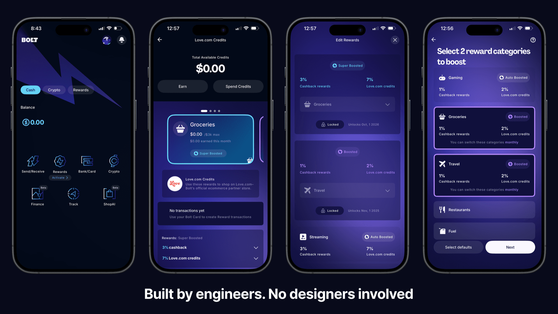
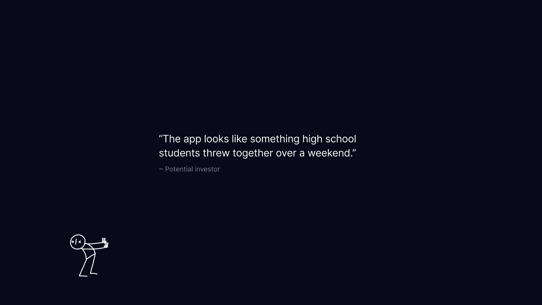
The engineering team had pulled it off, technically. A working app existed. But it had been assembled quickly and without much structure, with features added through multiple integrations, scattered across the product in a chaotic way. When the company began preparing to present to investors, it became clear the app wasn't ready. Not even close.
The problem02
Core issues
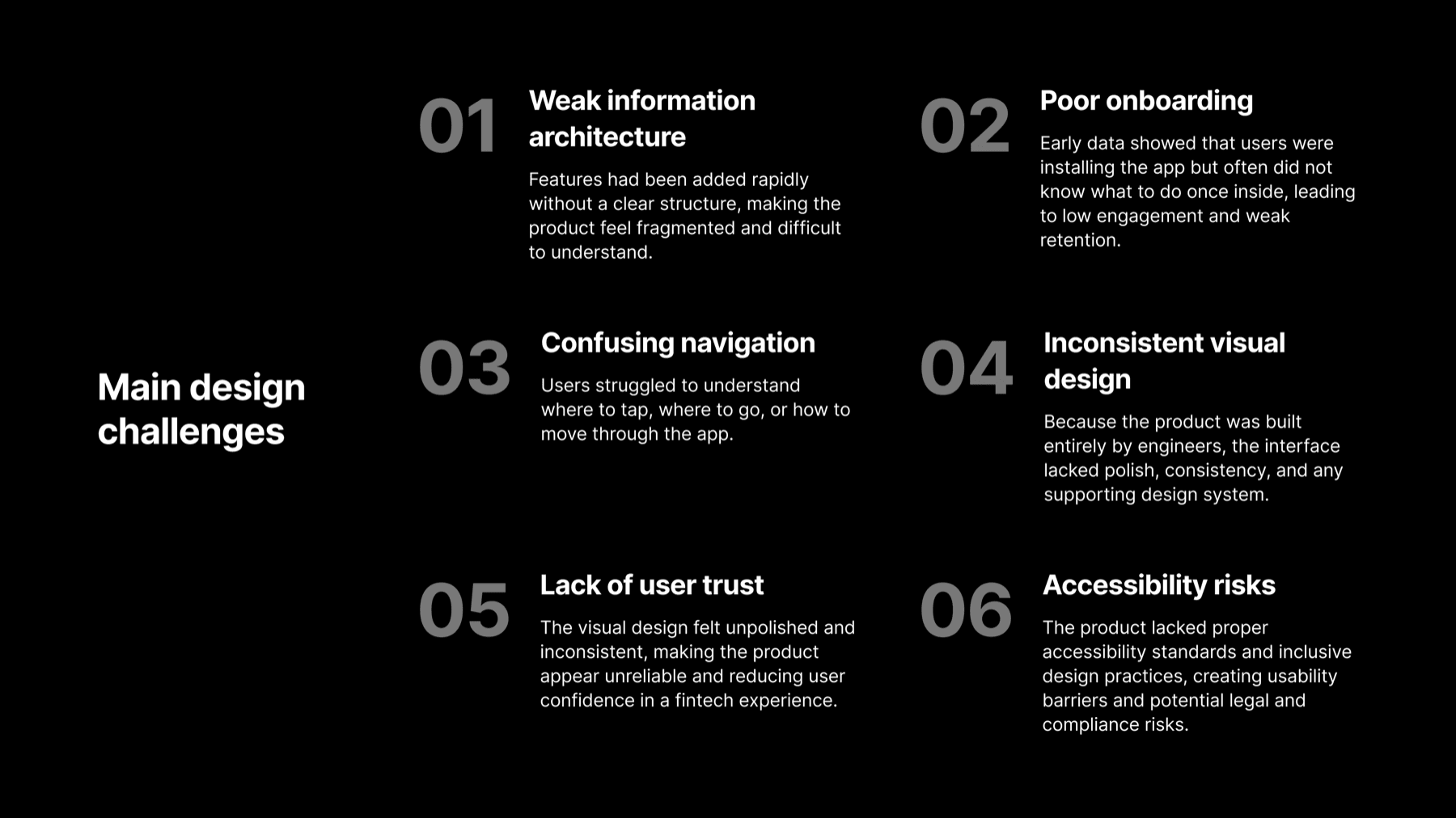
Several things were actively holding the product back. Navigation was confusing and users didn't know where to tap, where to go, or how to move through the app. The information architecture was fragmented, with features piled on without a clear structure. Onboarding was broken and people installed the app only to immediately feel lost, leading to low engagement and poor retention. The visual design, built entirely by engineers, lacked consistency, polish, and any kind of system behind it.
My role
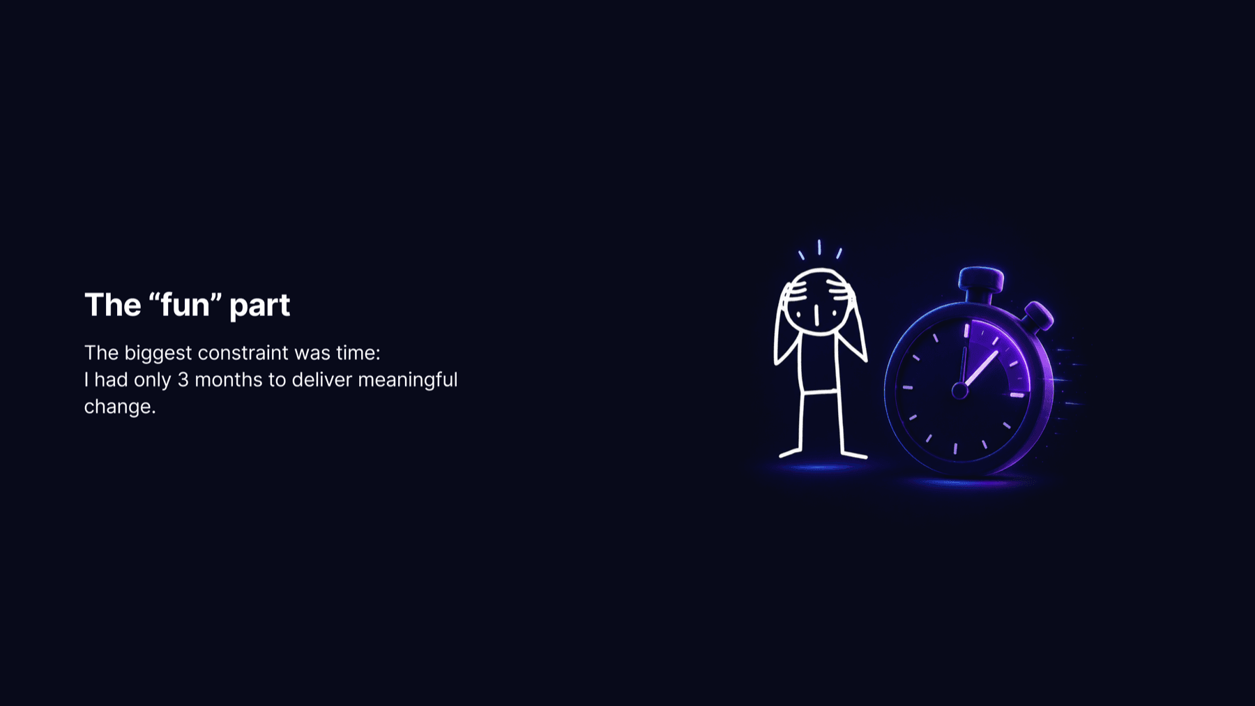
That's when the company brought in a seasoned UX designer, me. My job was to bring order to the product, improve usability and visual quality, and transform a scattered collection of features into a coherent app experience. The biggest constraint: I had three months to make it happen.
Goals03
Design goals
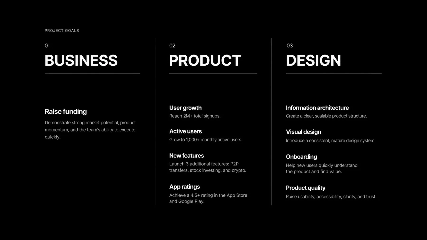
The work had to serve both the product and the business at the same time. On the product side: rebuild the information architecture, introduce a proper design system, fix onboarding, and raise the overall quality across usability, accessibility, and trust. On the business side: help the company reach 2M+ registrations, grow to 1,000+ monthly active users, launch three new features, hit 60% feature parity with competitors like PayPal, Revolut, and Wise, and achieve a 4.5+ app store rating.
Mission
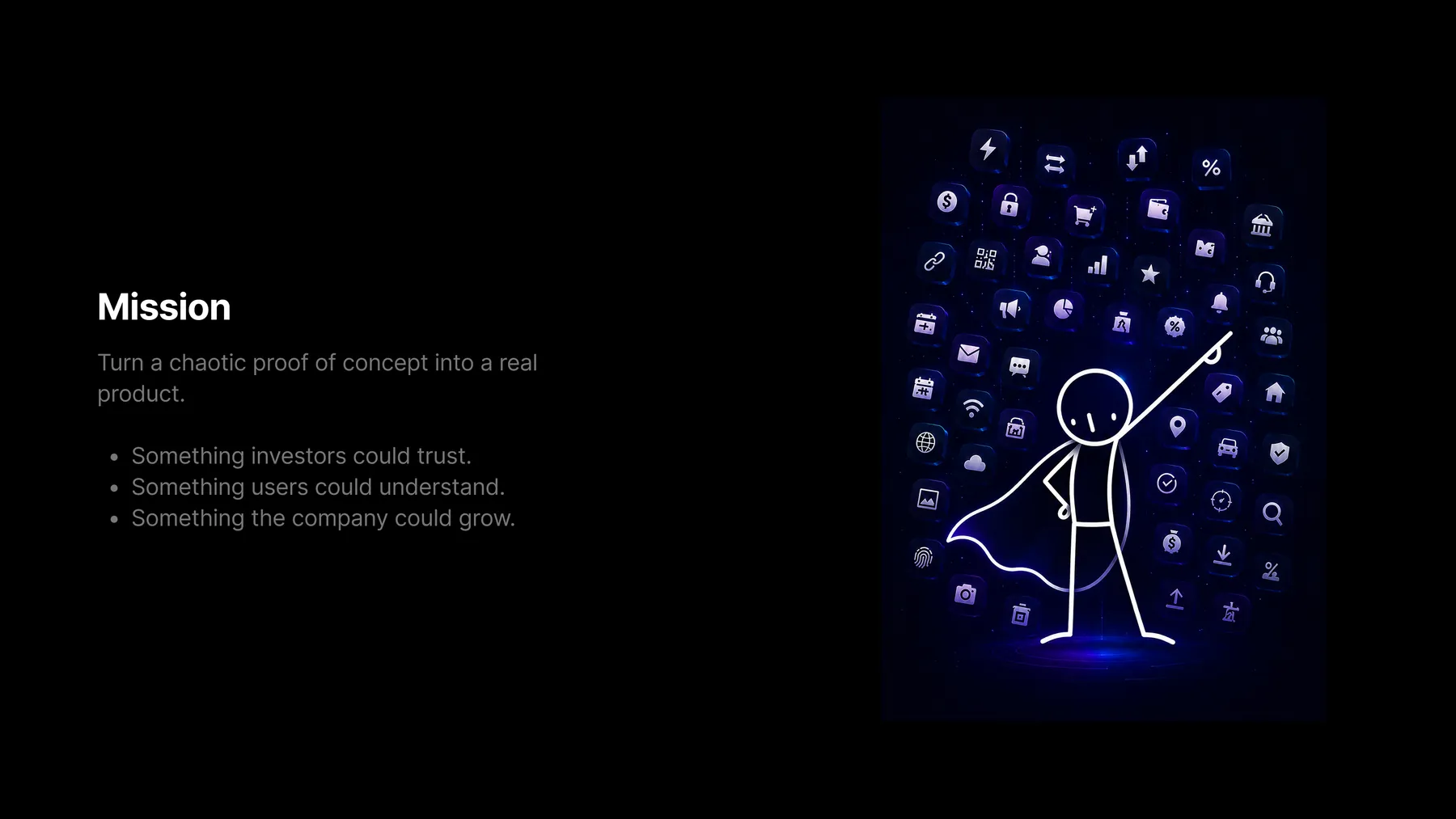
Turn a chaotic proof of concept into a real product foundation. Something investors could trust. Something users could understand. Something the company could actually grow.
Discovery04
Customer support insights
I started with the people closest to the users: customer support. I booked time with support reps and asked them to walk me through the most common complaints, repeated questions, and confusing moments they heard every day. It gave me a fast, unfiltered view of where the product was genuinely failing real customers, before I had ever opened the app myself.
Product audit
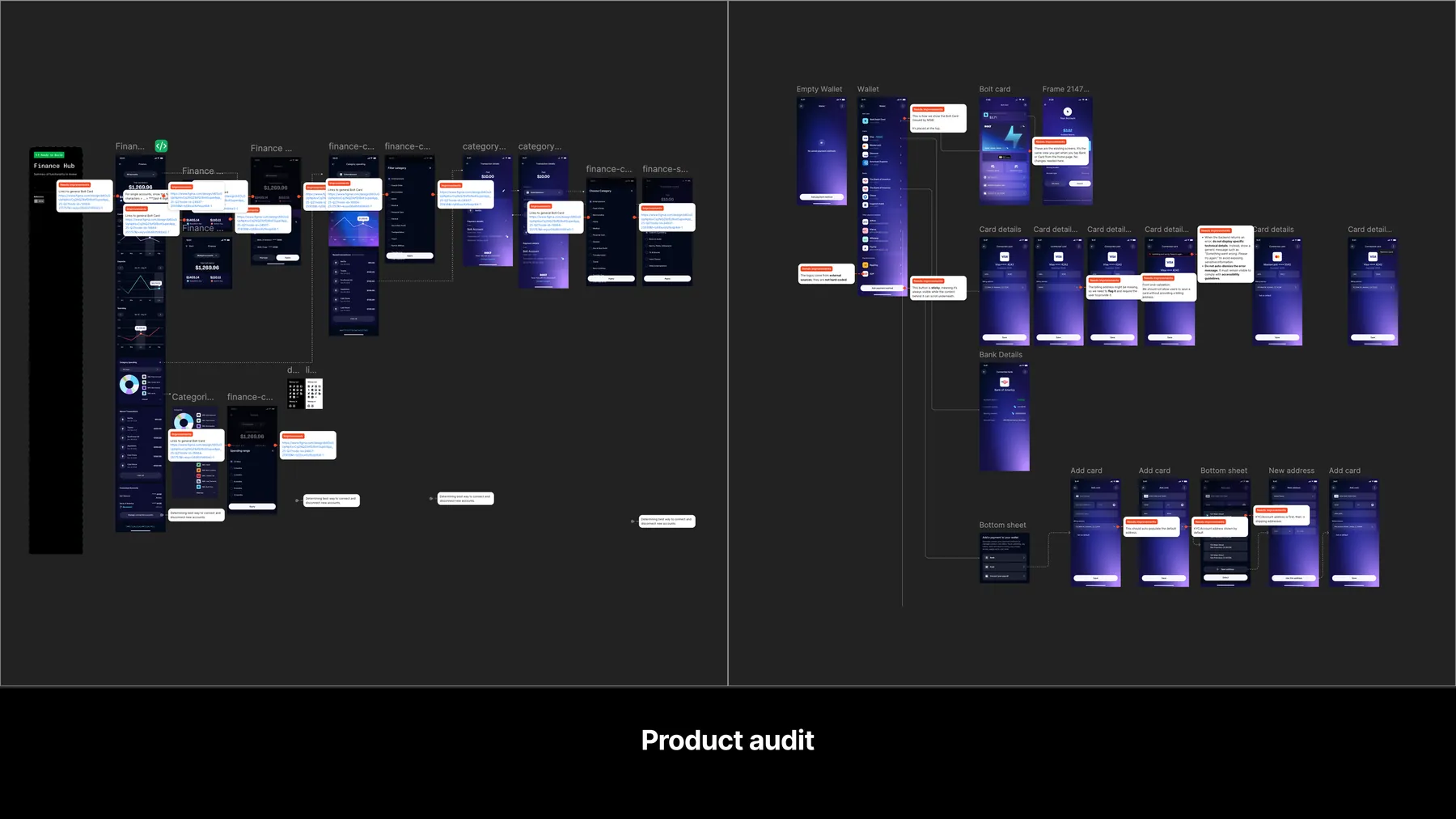
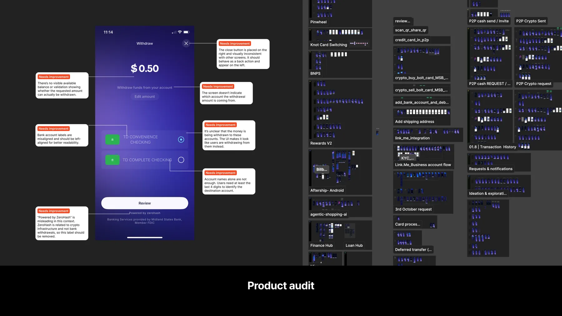
Next, I became the user. I installed the app, went through every flow, tested every feature one by one, and documented every usability issue I could find. This gave me a first-time user's perspective and helped me see exactly where the friction was, not just in theory, but in practice.
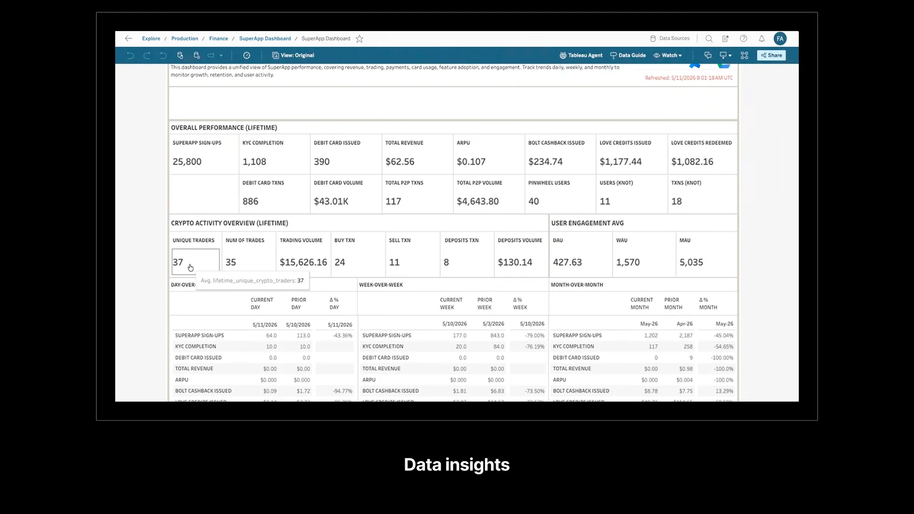
Data insights
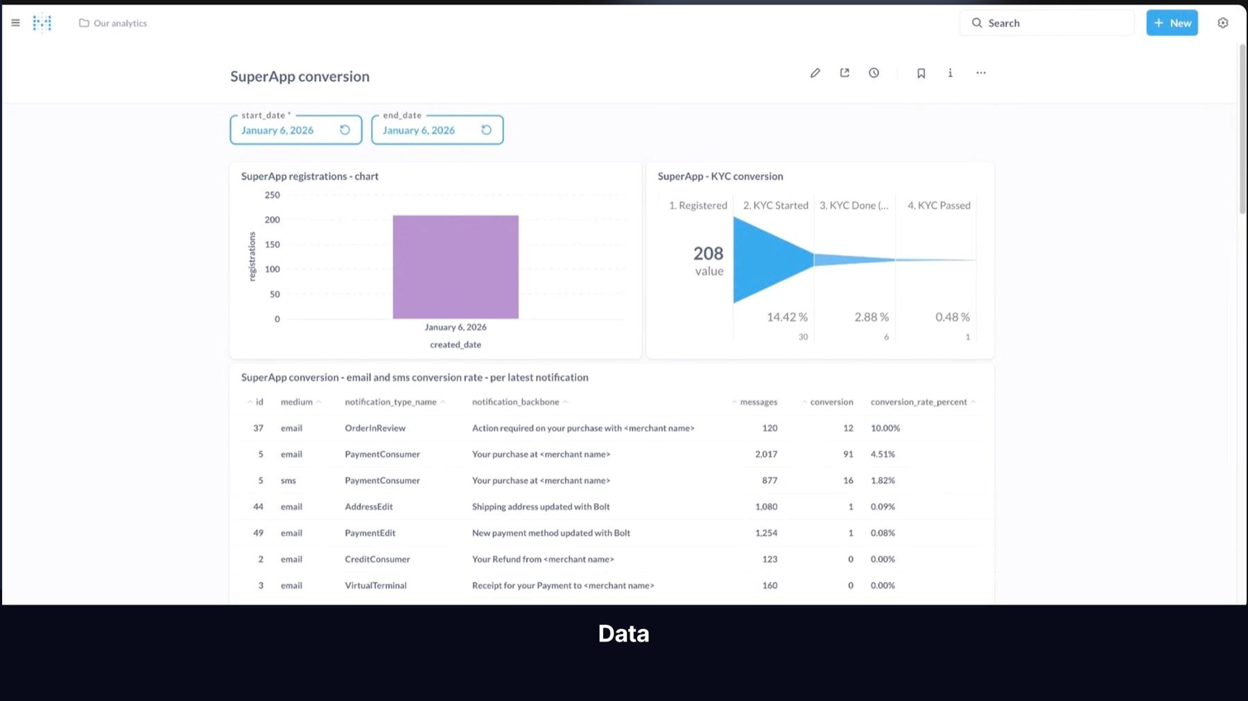
To balance what people were saying with what was actually happening, I set up access to product analytics through DataDog. I looked at total users and registrations, iOS vs Android split, registration and KYC completion rates, the most used features, and where users were dropping off. Facts, not assumptions.
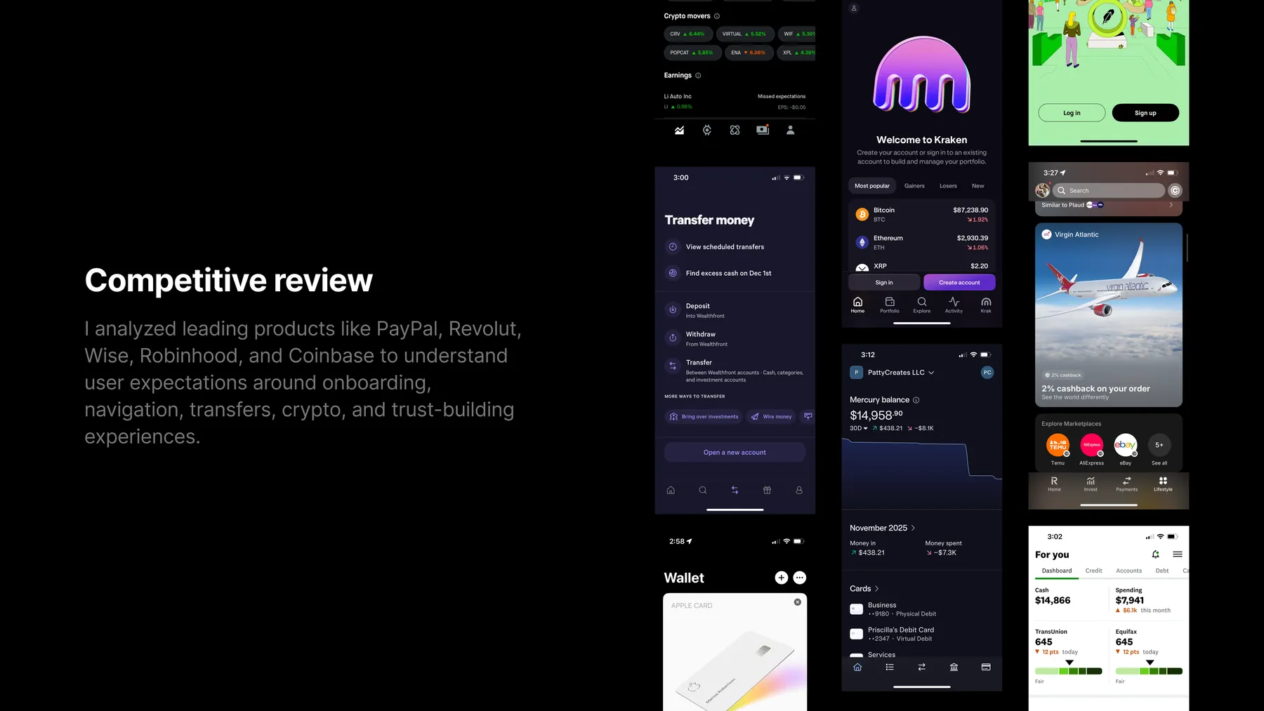
Competitive review
Finally, I looked outside the company. I signed up for PayPal, Revolut, Wise, Robinhood, and Coinbase and studied how each of them handled onboarding, navigation, transfers, investing, crypto, and trust building. This helped me understand what users already expected from products like this, and where our most obvious gaps were.
Design05
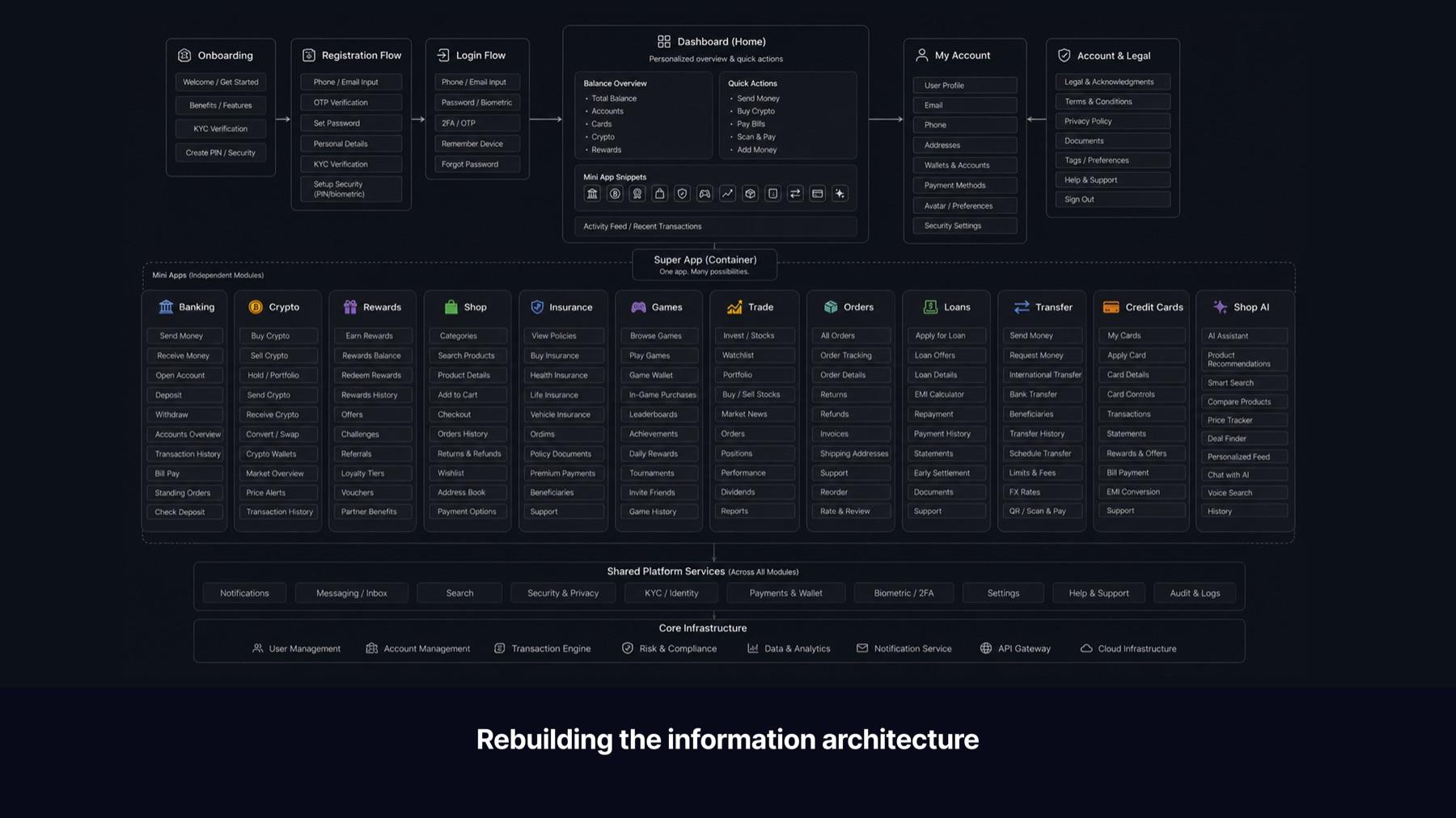
Rebuilding the information architecture
After reviewing all the research, one thing was clear: the app needed a completely new structure. Everything had been built around a single home screen, a grid of feature buttons sitting under a balance total. There were no quick actions, no personalization, no clear next step. Every new feature just added more clutter. Users landed there and immediately felt lost. And as a model, it wasn't scalable. It would only get worse over time.
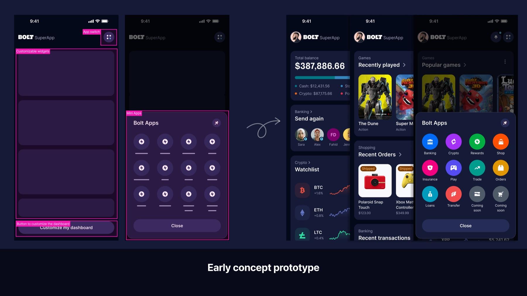
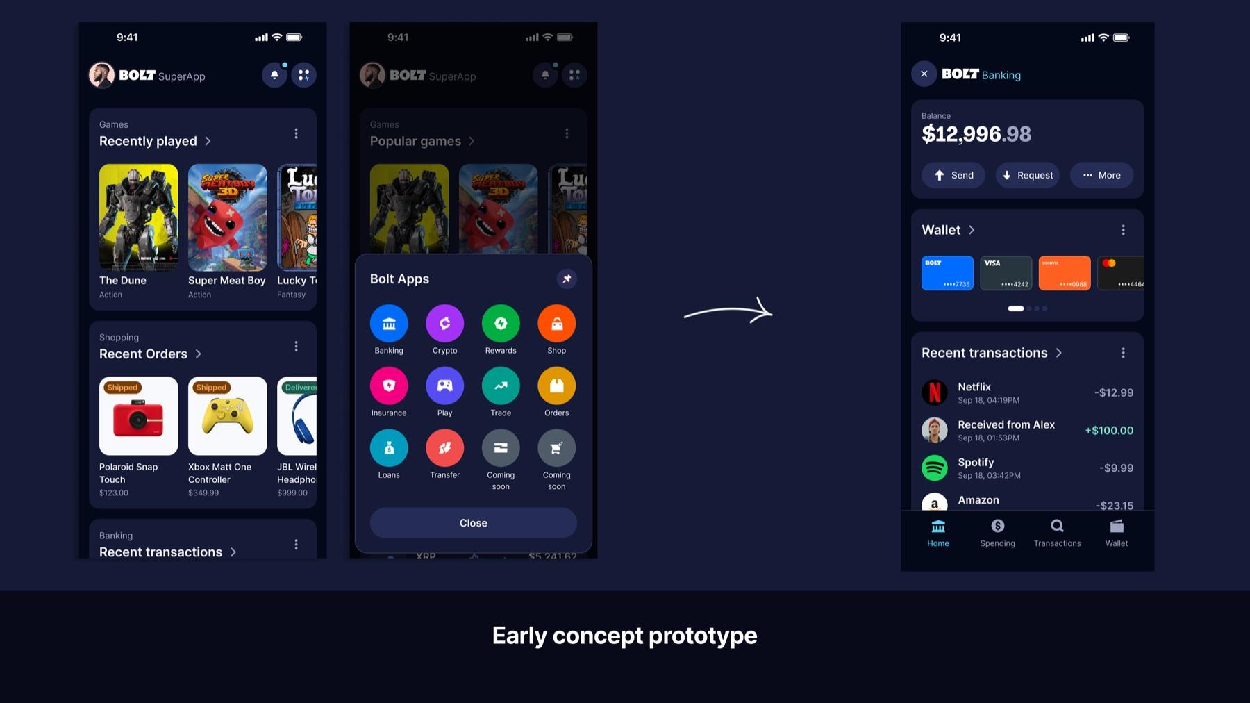
Early concept prototype
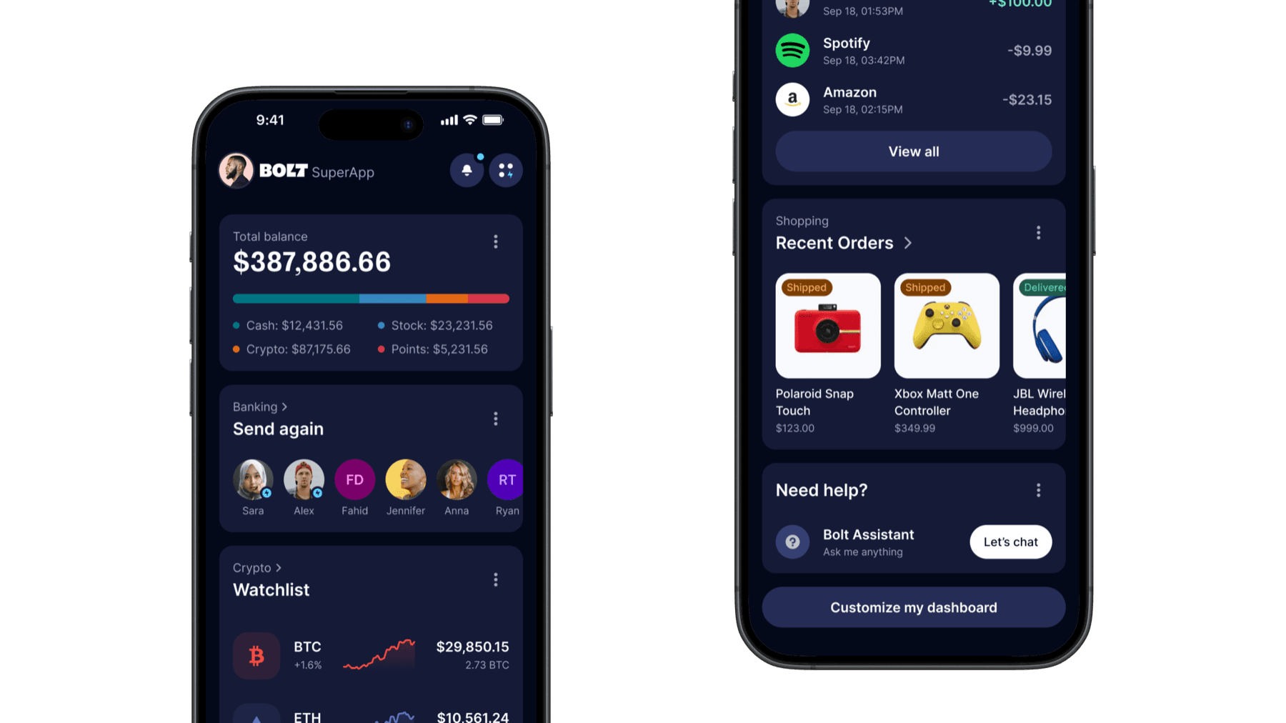
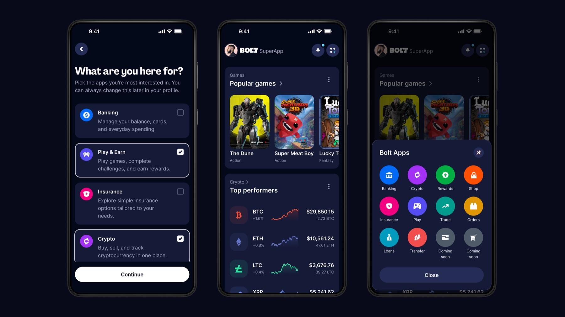
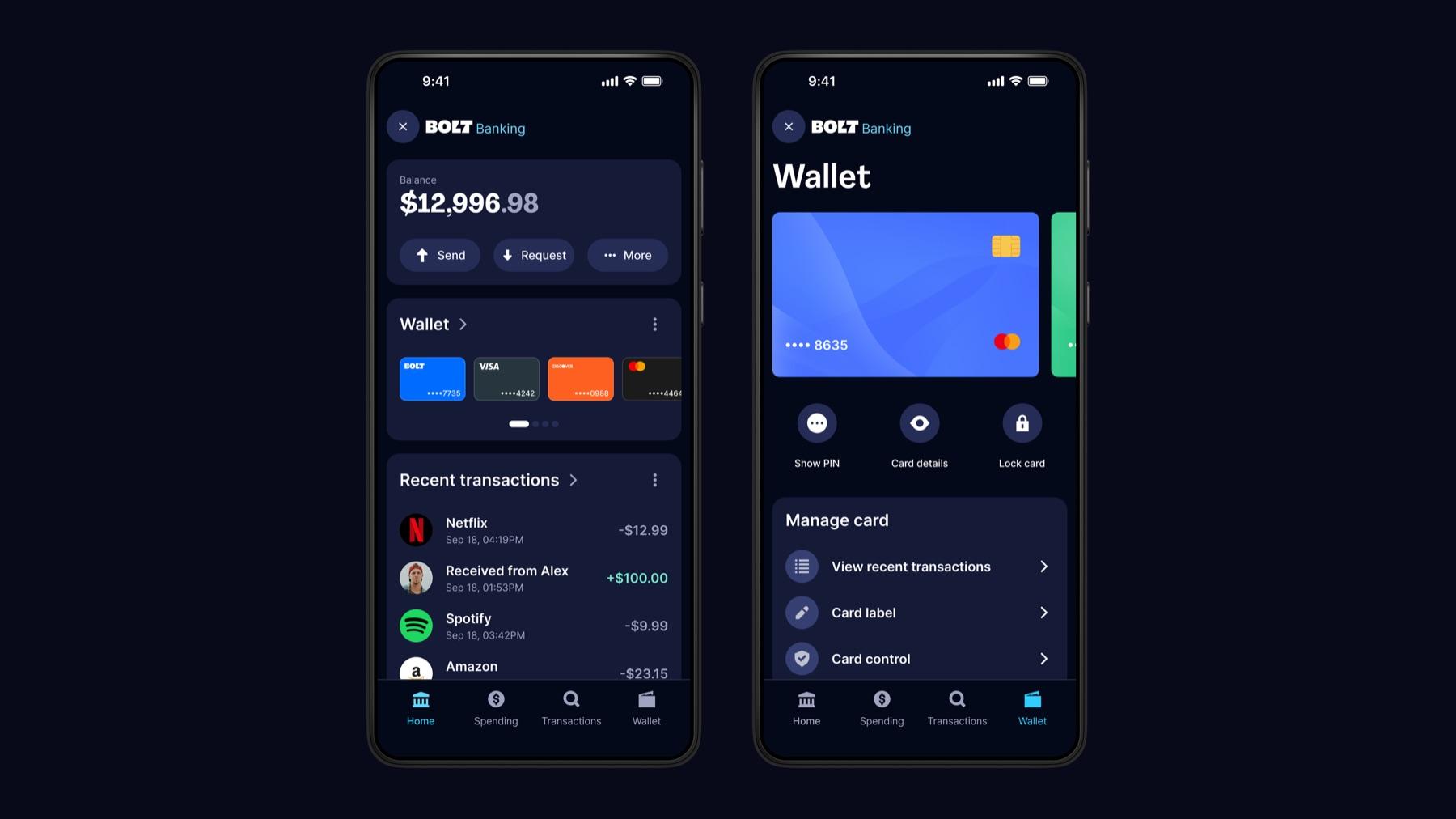
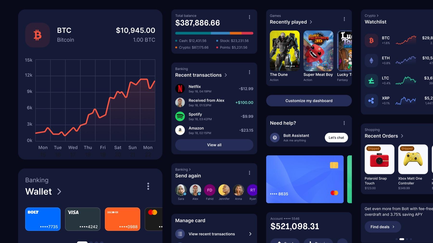
I moved quickly. Based on the research, I designed an early concept built around a modular system: a customizable dashboard supported by independent mini-apps. The dashboard gave each user a personalized home screen with shortcuts to what they used most. The mini-apps, banking, crypto, transfers, shopping, order tracking, each lived as their own self-contained product area. One shared account identity tied everything together across the ecosystem.
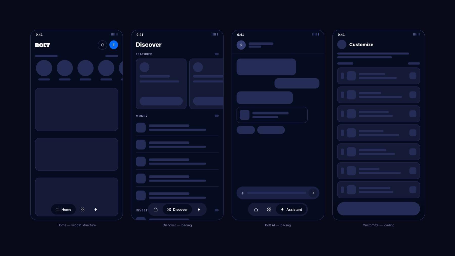
Fixing the onboarding funnel
The data told a brutal story. Of everyone who registered, only 7% started or completed KYC. Only 2% were approved. Just 0.3% created a bank account. The biggest drop-off was happening before users ever experienced anything. The app had started as a banking product, so everyone had to complete full identity verification before they could do anything at all, even browse. That made sense for a bank. It made no sense for a SuperApp.
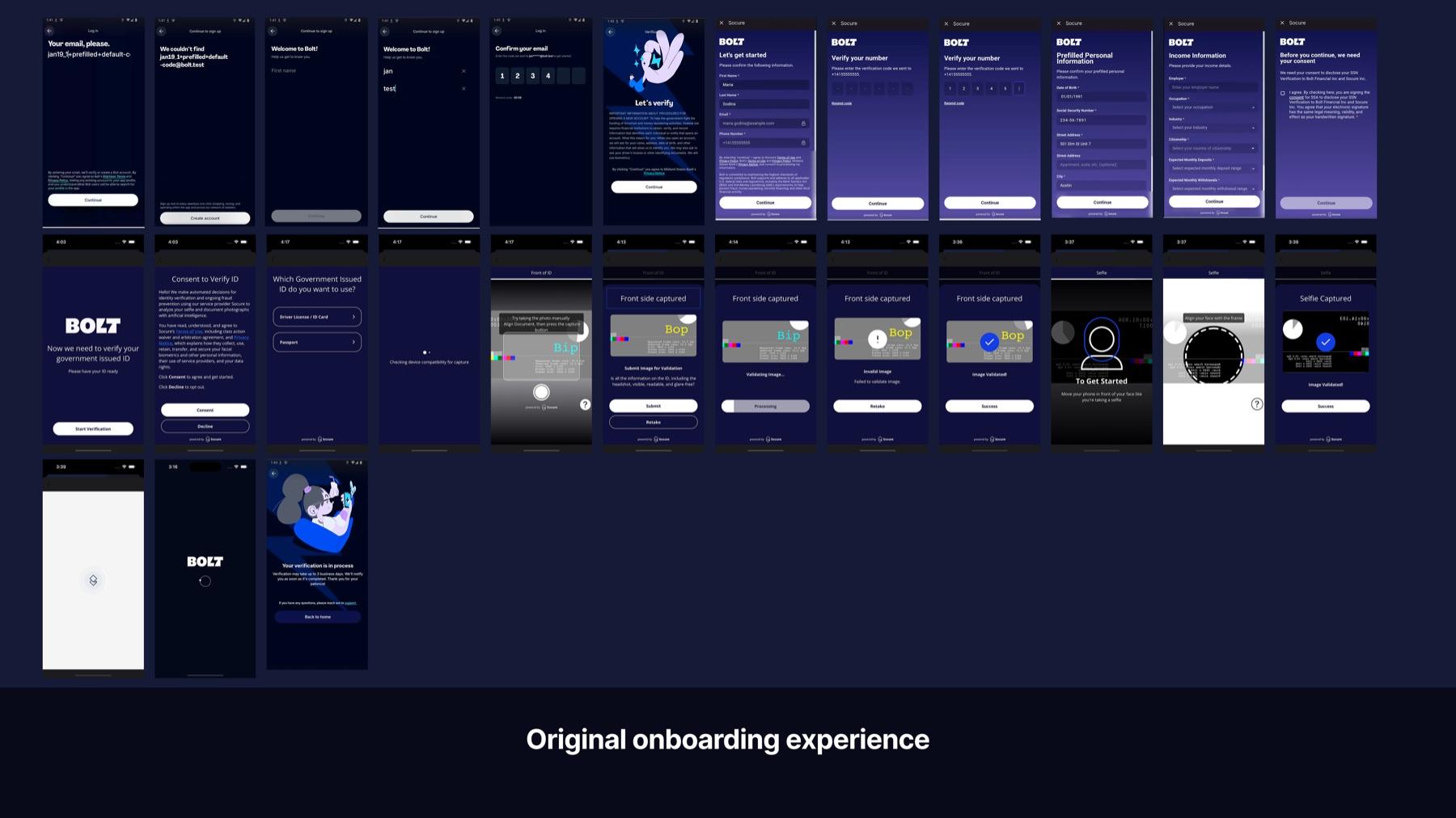
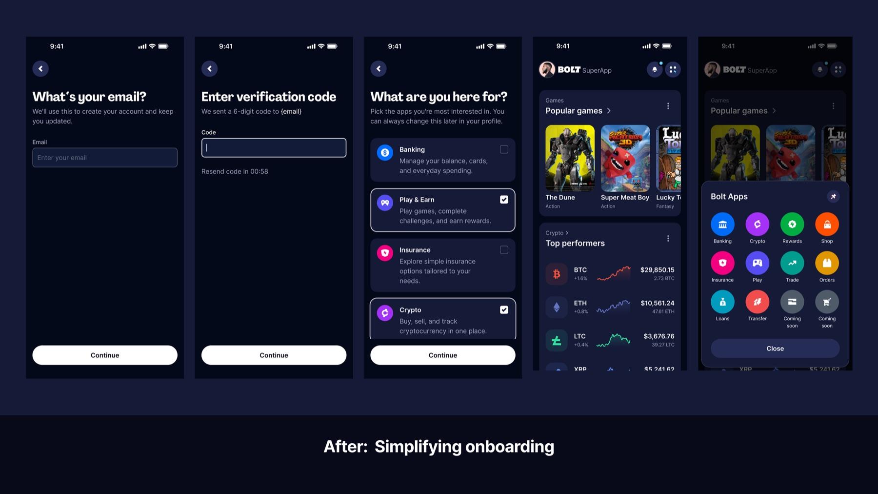
Rebuilding onboarding for growth
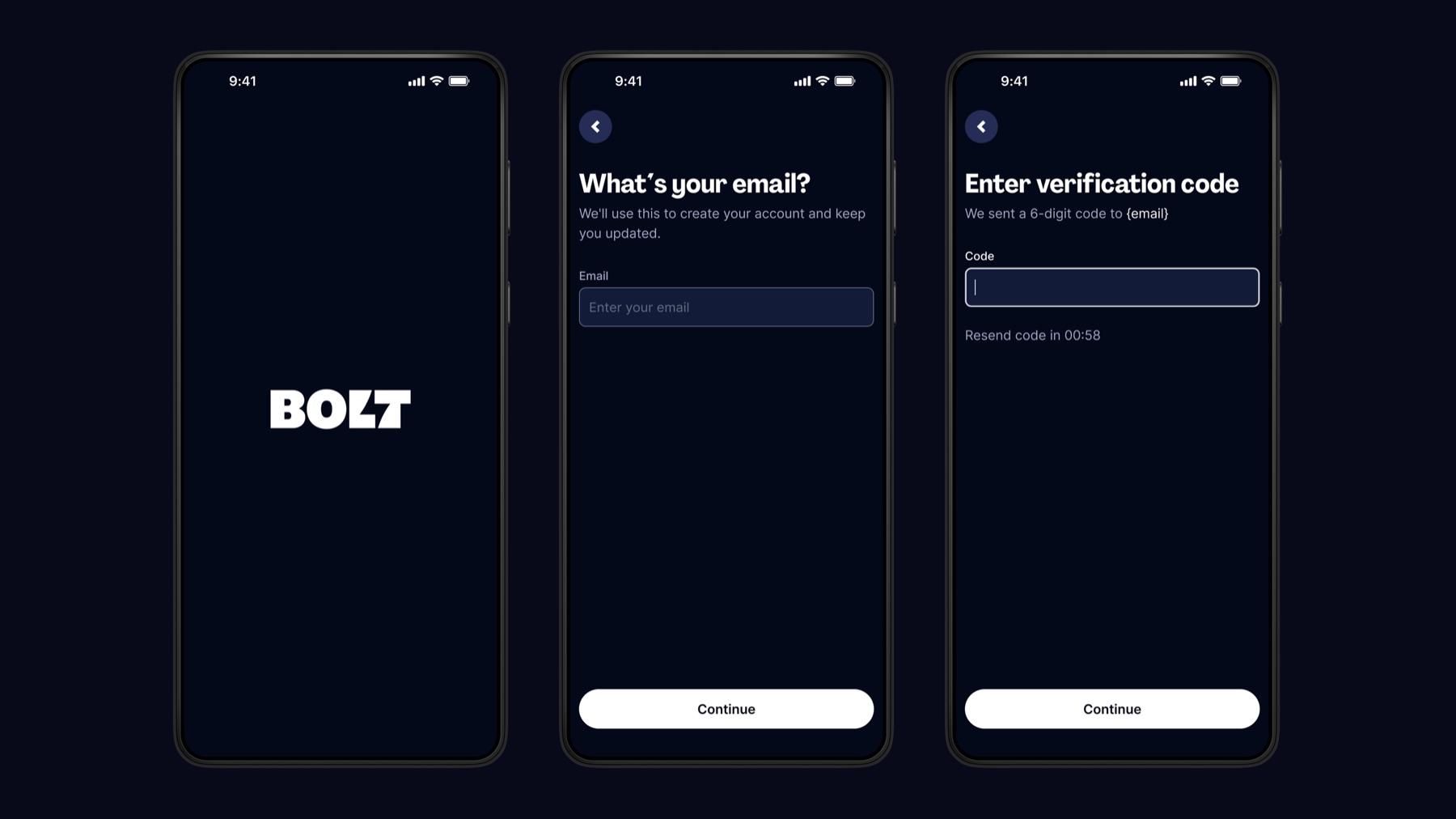
I redesigned the onboarding so users could enter the app immediately and start using features that didn't require any identity verification, like shopping, order tracking, and browsing the ecosystem. KYC was moved to the moment of need, triggered only when a user wanted to do something that genuinely required it: crypto, investing, P2P transfers, banking. This reduced friction, improved the first-time experience, and gave users a reason to stay before asking them to trust us with sensitive information.
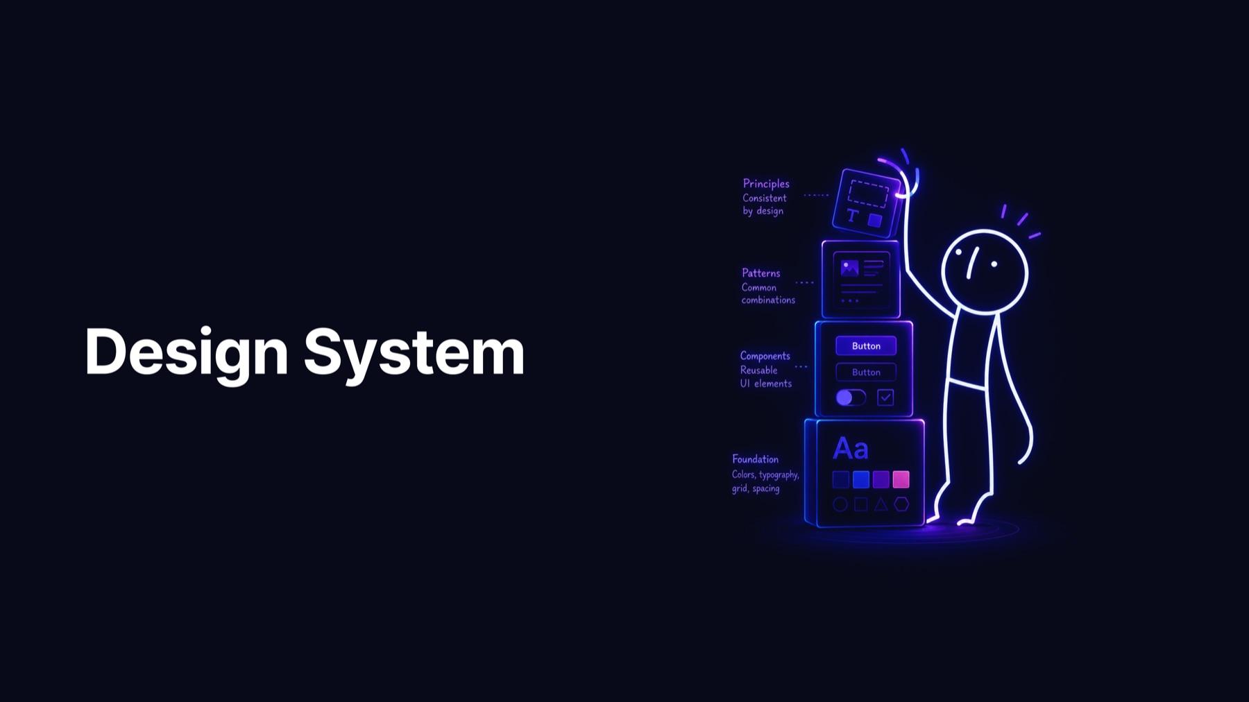
Creating the core components
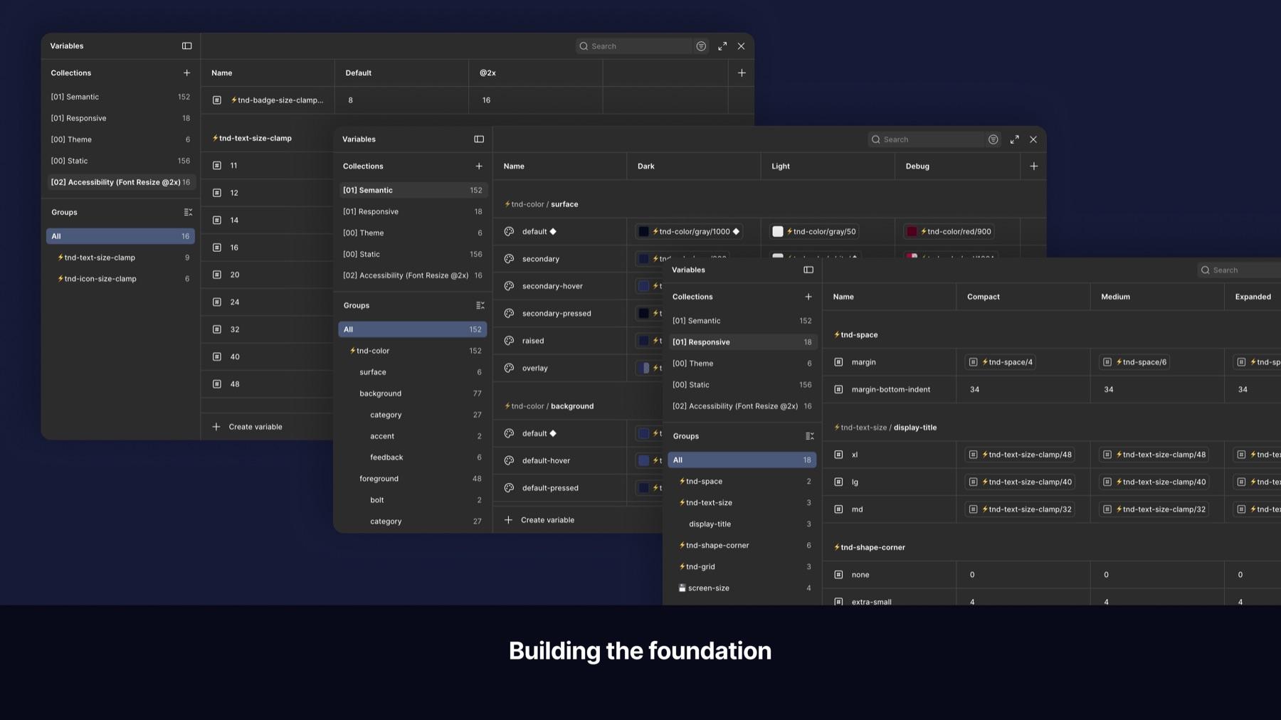
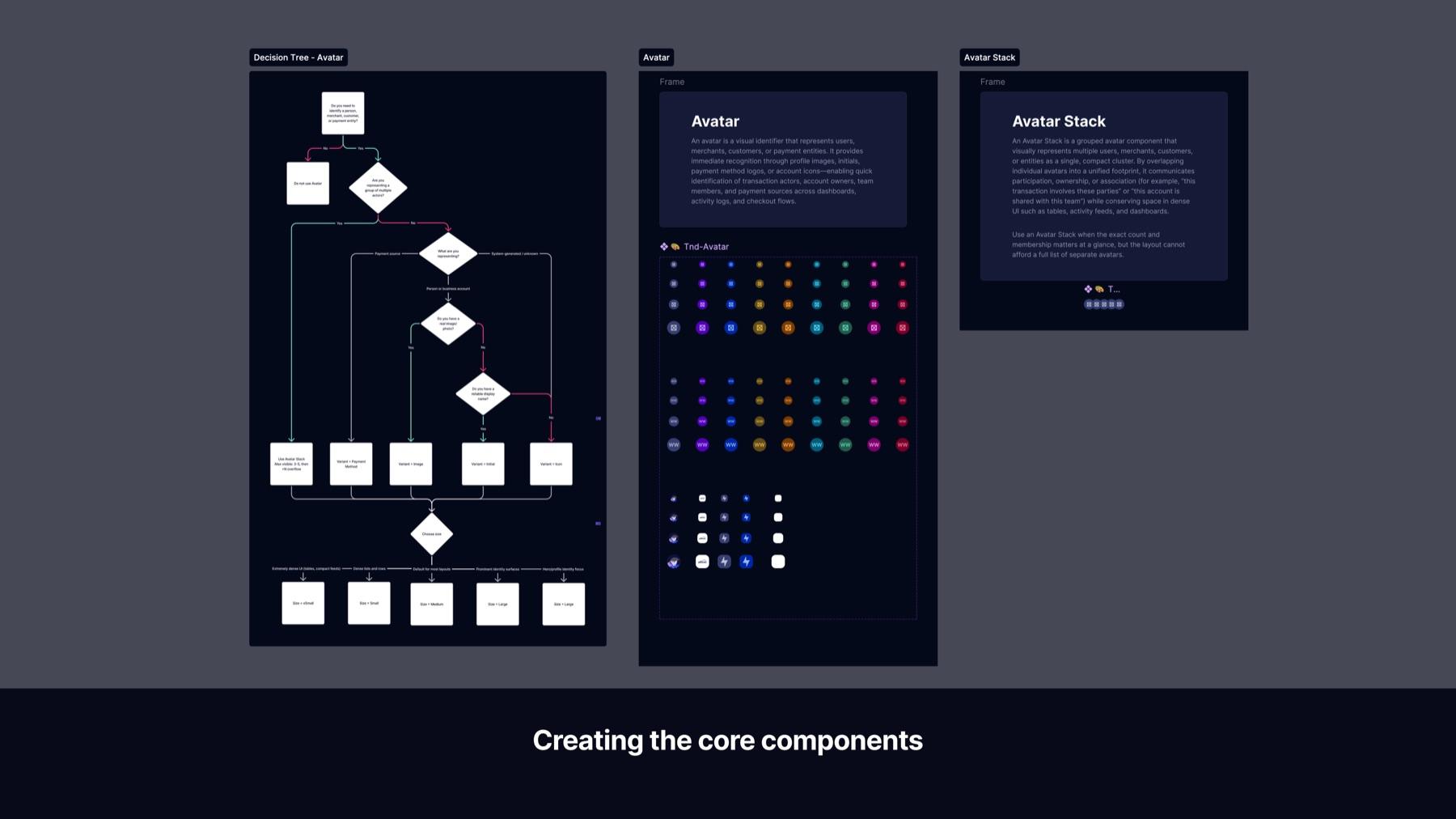
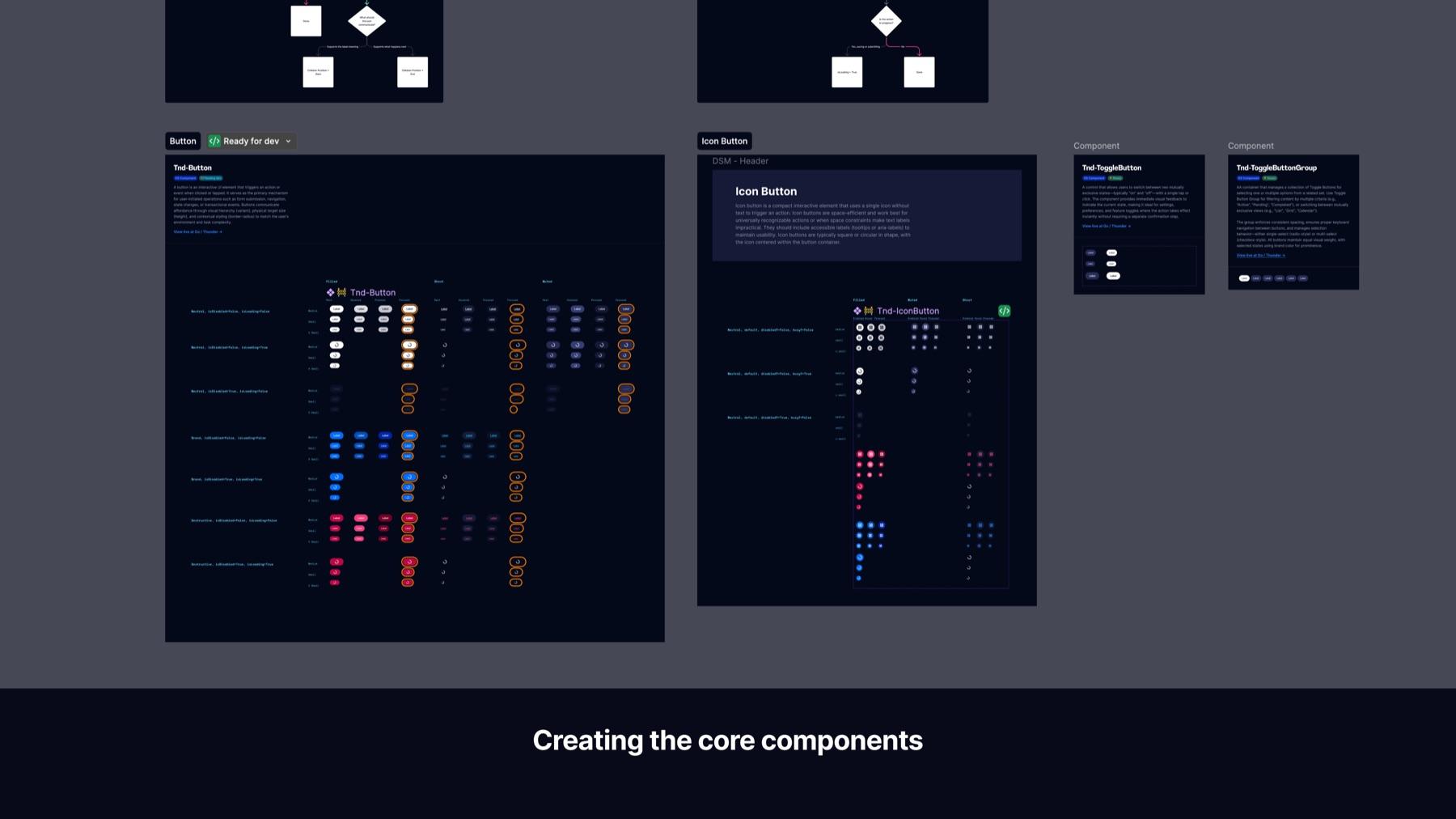
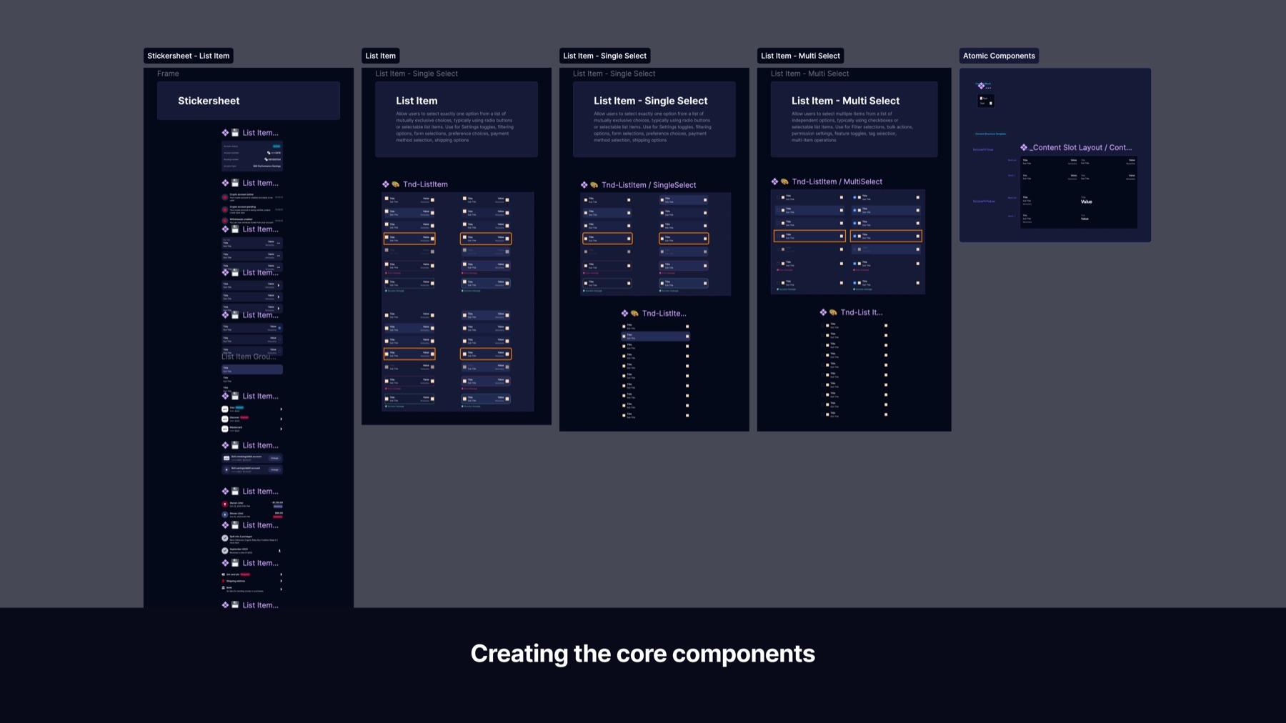
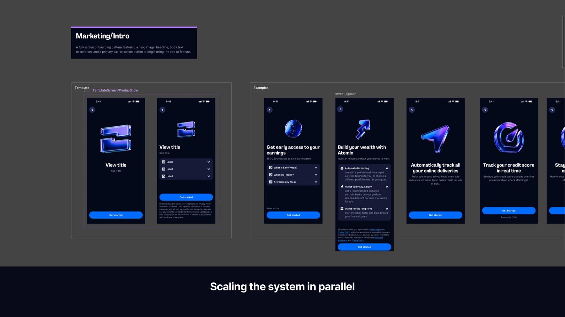
One of the biggest underlying problems was visual inconsistency. The app had been built without any design system, with styles hard-coded, components duplicated, and theming nearly impossible. I started by building the foundation layer from scratch: color tokens, typography, spacing, corner radius rules, and an icon library. This became the shared language for everything that followed.
Scaling the system in parallel
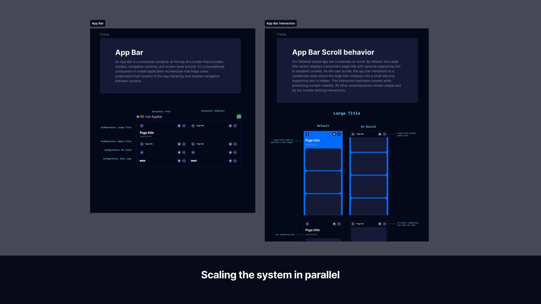
With the foundation in place, I built out the most commonly used UI components: buttons, inputs, checkboxes, toggles, avatars, loaders and states. I focused on the high-frequency building blocks that appeared across the most screens, and raised the visual quality of each one to make the product feel more premium and trustworthy. These reusable components brought consistency to the experience while reducing both design and engineering effort across the board.
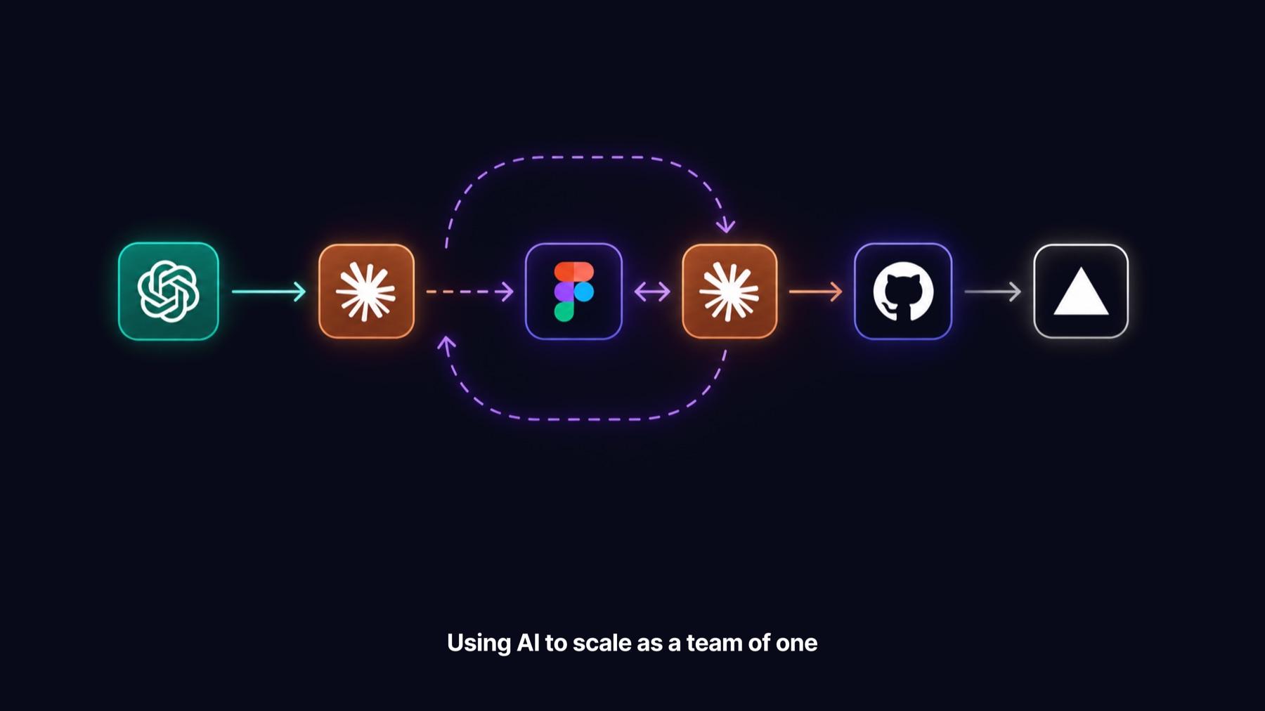
Using AI to scale as a team of one
I was the only designer on a workload that would normally require a full team. To keep up, I built a tight workflow around AI tools. I used Cursor and Claude Code to generate concepts and interfaces, Figma to refine and polish the details, and Google Flow with Gemini for image generation. The loop was continuous: generate, refine, feed improvements back in, and keep evolving. Instead of delivering static mockups, I produced interactive coded prototypes that engineers and stakeholders could actually experience, which cut alignment time and kept the team moving fast.
Delivery06
The work I delivered
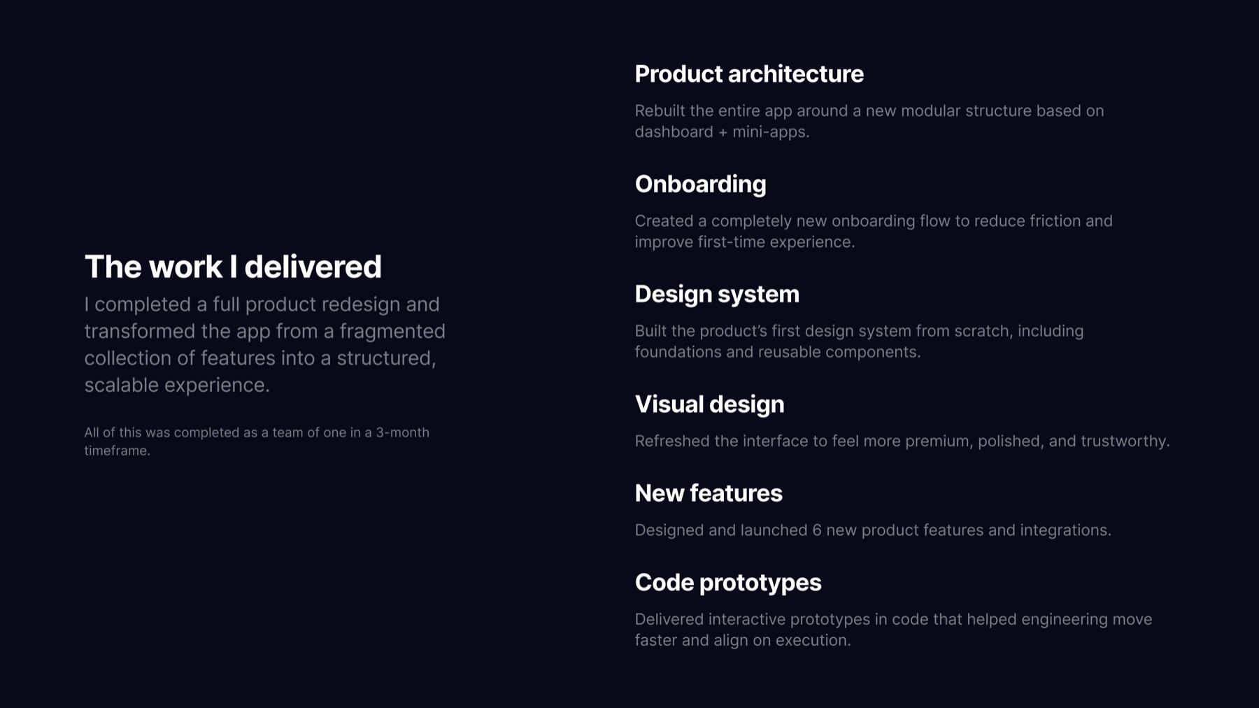
In three months, as a team of one, I completed a full product redesign. I rebuilt the entire app around a new modular architecture: dashboard plus independent mini-apps. I created a completely new onboarding flow to cut friction and improve the first-time experience. I built the product's first design system from scratch, foundations through components. I refreshed the visual design to feel more premium and trustworthy. I designed and shipped six new features and integrations, crypto, trading, gaming, loans, and credit score among them, double the three originally scoped. And I delivered interactive coded prototypes that helped engineering move faster and align on execution with far less back-and-forth.
Gamified user testing
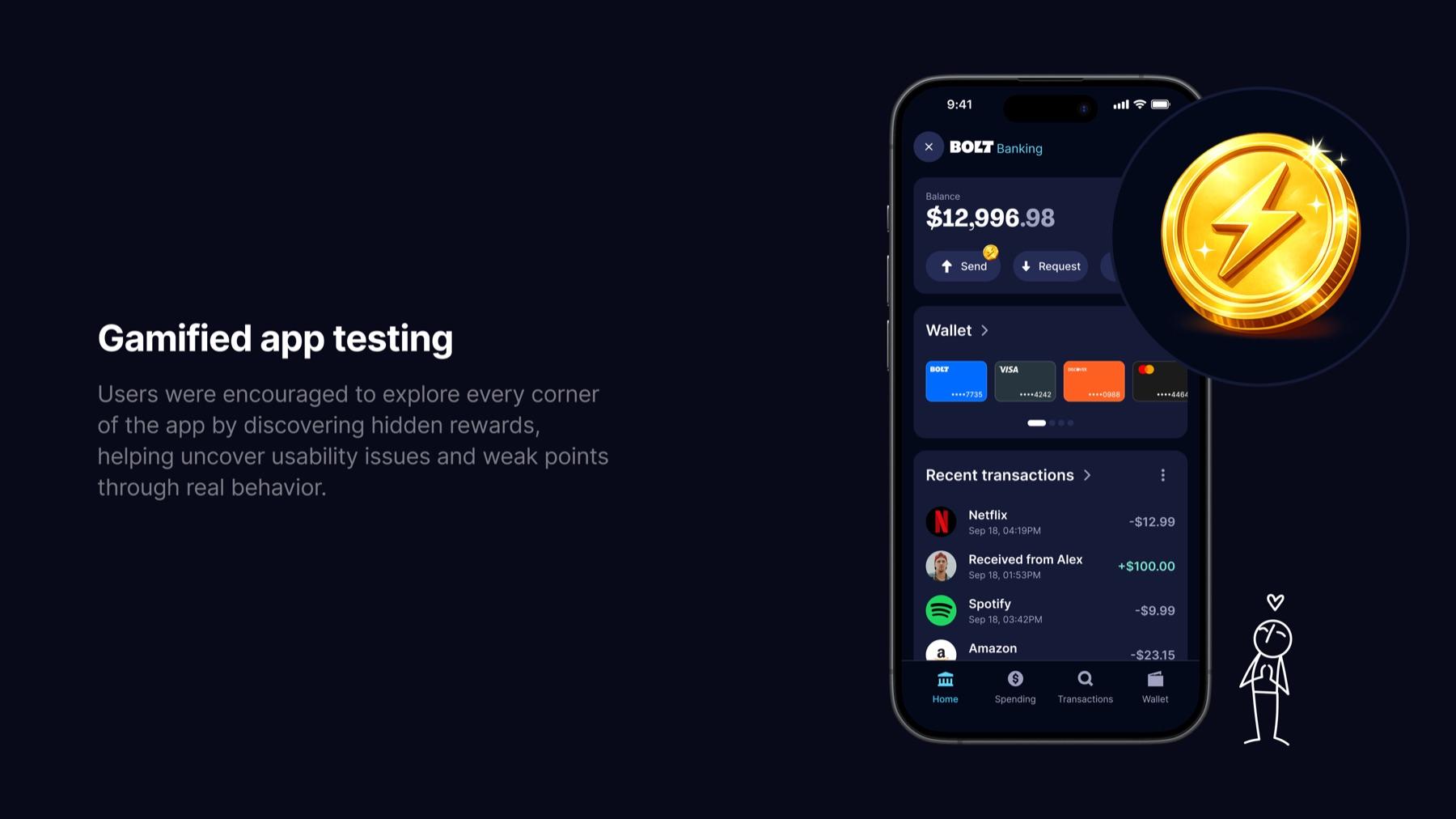
Once the redesign was ready, I needed real user feedback, but there was no time or budget for traditional research. So I turned testing into a game. I hid coins throughout the app, placed across different screens and features. To find them, users had to naturally explore the product, move through flows, and interact with the new experience. Each coin earned points redeemable for cashback or partner rewards. Users had fun and earned something real. We got genuine behavioral data from real users. And we quickly spotted the flows that still caused confusion, without ever asking anyone to participate in a test.

Results07
Results
The redesigned SuperApp shipped, live on iOS and Android. But three months in, the numbers told a more complicated story than the growth pitch that got this project greenlit.
~10K
Total registrations
Target was 2M+. Onboarding friction and weak retention kept growth well below the original pitch.
~23
Daily active users
Most people arrived through Checkout, explored the app once, and rarely came back.
4.6★
App Store rating
Looked strong on paper, but a noticeable share of the reviews came from internal employees, which made the signal less reliable.
6
Integrations launched
Crypto, trading, gaming, loans, and credit score all shipped on a foundation that didn't exist three months earlier, double what was originally scoped.

One app. Too many lessons.
The growth numbers weren't the win the original pitch promised. But a chaotic proof of concept became a real, structured product, with its own architecture, onboarding, and design system, that the team could actually keep building on after I moved on.
Thank you for scrolling all the way!