PatPat search revamp
A deep dive into revamping the PatPat mobile app's search experience: user research and competitive analysis leading to a redesigned search flow that cut drop-off and lifted engagement.
Client
PatPat
Role
Lead Designer
Responsibilities
Research, Product Design, User Testing
Overview01
Introduction
In this case study, I'll share my contribution to improving the search experience for the PatPat mobile app. Typically, in an agency setting, we don't get to see the results of our work, we deliver and move on. However, this project was different, allowing me to stay long enough to see the impact of our efforts.

About PatPat
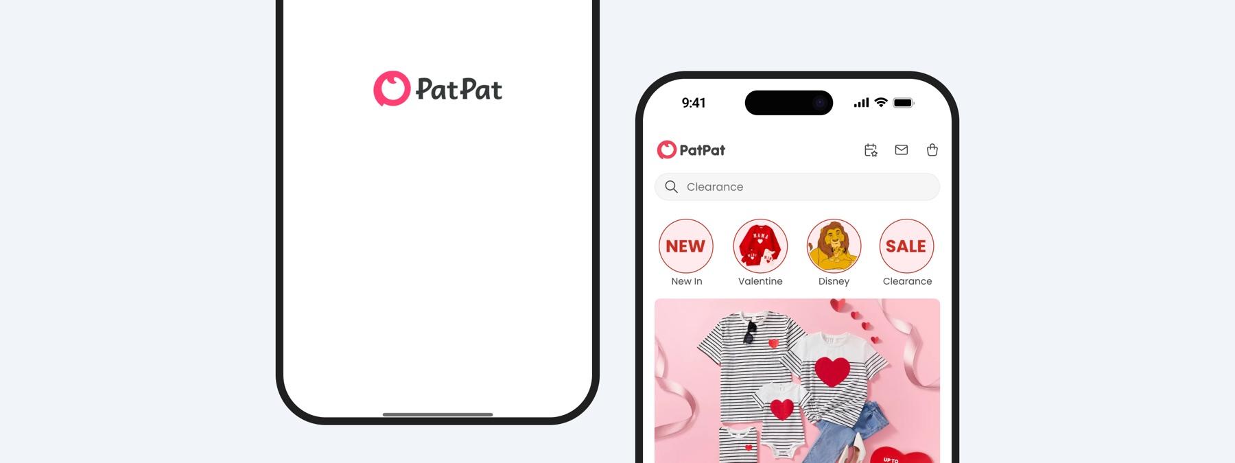
PatPat is a curated online boutique of fashionable matching outfits for the whole family to bring the crew together in style.

The opportunity
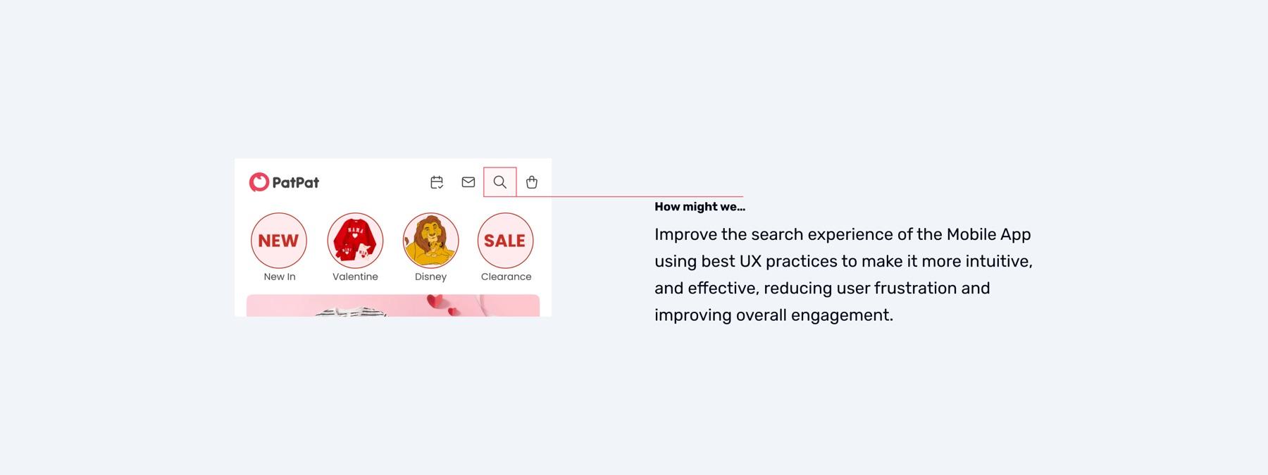
Our analysis revealed that search performance was falling short. Collaborating with engineers, our product team gathered data to quantify the issues and confirm the need for improvements. About 62% of users exited the app within the first two minutes of use, indicating frustration or difficulty navigating to their desired content. Only 18% of users engaged with the search functionality at all, and among those who did, 46% abandoned the process after viewing the results page, unable to find what they were looking for or unwilling to trust the results. The design challenge: improve the search experience using best practices in usability to make it more intuitive, engaging, and effective, reducing user frustration and improving overall engagement.
Research02
User interviews
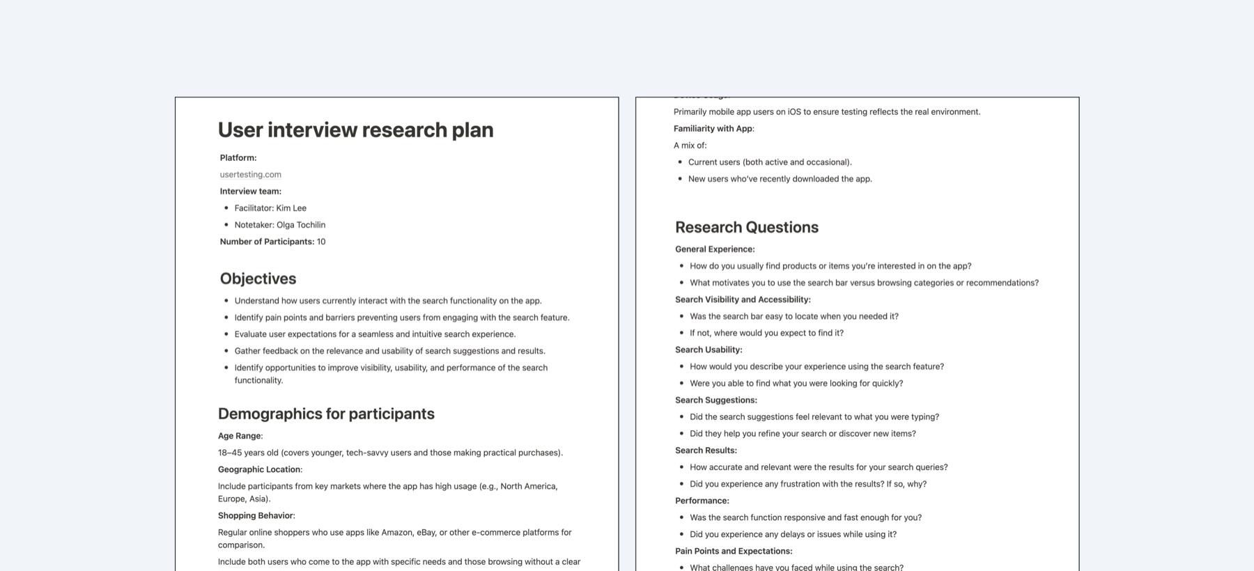
Despite having quantitative data, we needed deeper qualitative insights into search usage. I collaborated with our researcher to conduct a series of user interviews, recruiting participants through usertesting.com to gather firsthand feedback and better understand user behavior and pain points. Four things stood out: low visibility (the search bar wasn't prominent enough, so users relied on browsing instead), no search suggestions while typing, irrelevant search results that didn't match queries, and missing filter and sorting options that made search feel incomplete.
Competitive analysis
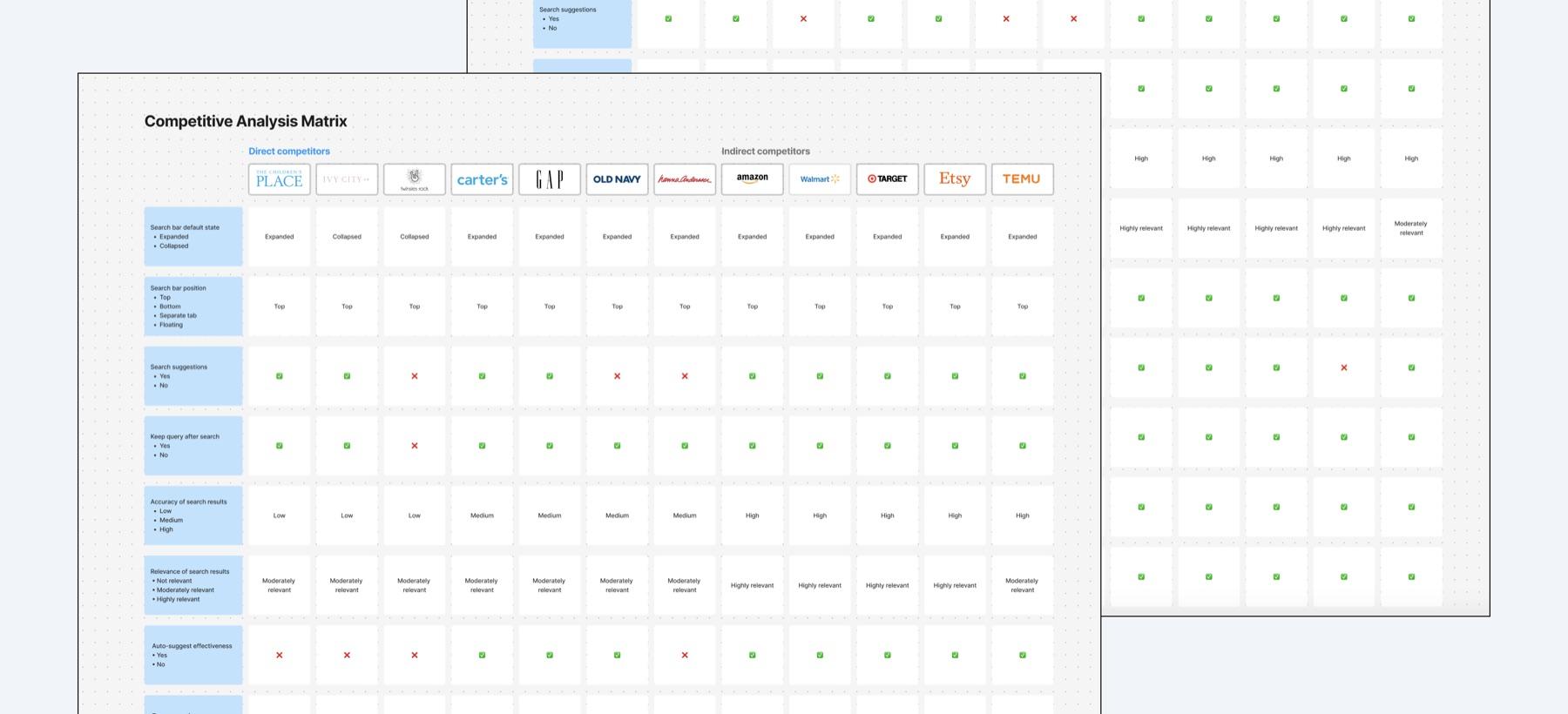
Alongside the quantitative and qualitative insights, I ran a competitive analysis to benchmark search functionality against both direct and indirect competitors. This helped identify common industry standards and emerging trends, evaluating search bar visibility, autosuggestions, typo correction, result relevance, filtering and sorting options, and how competitors handled empty search results.
Desk research
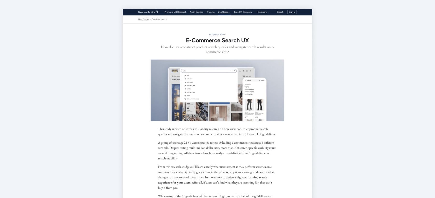
Finally, I conducted desk research to gather insights from industry-leading sources without direct user interaction: reviewing best practices, usability guidelines, and research findings from organizations like the Baymard Institute, Nielsen Norman Group, and Forrester Research. This gave us a solid foundation for our decisions, aligned with established UX principles and proven strategies.
Design03
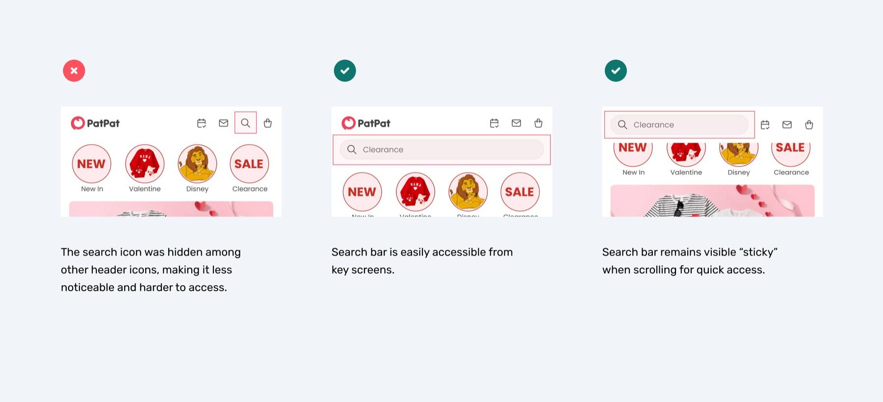
Search bar placement & visibility
The search bar has been improved by placing it prominently on key screens and ensuring it remains visible while scrolling, making it easier for users to locate and use the search function without unnecessary effort.
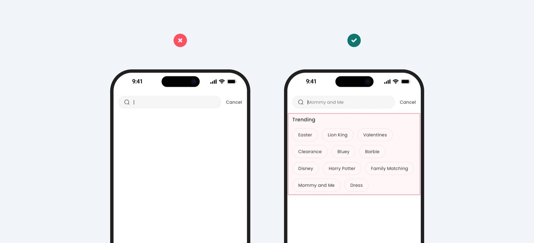
Trending searches
Popular search suggestions have been introduced to inspire users and encourage exploration, helping users discover trending items and engage with the app even when they don't have a specific product in mind.
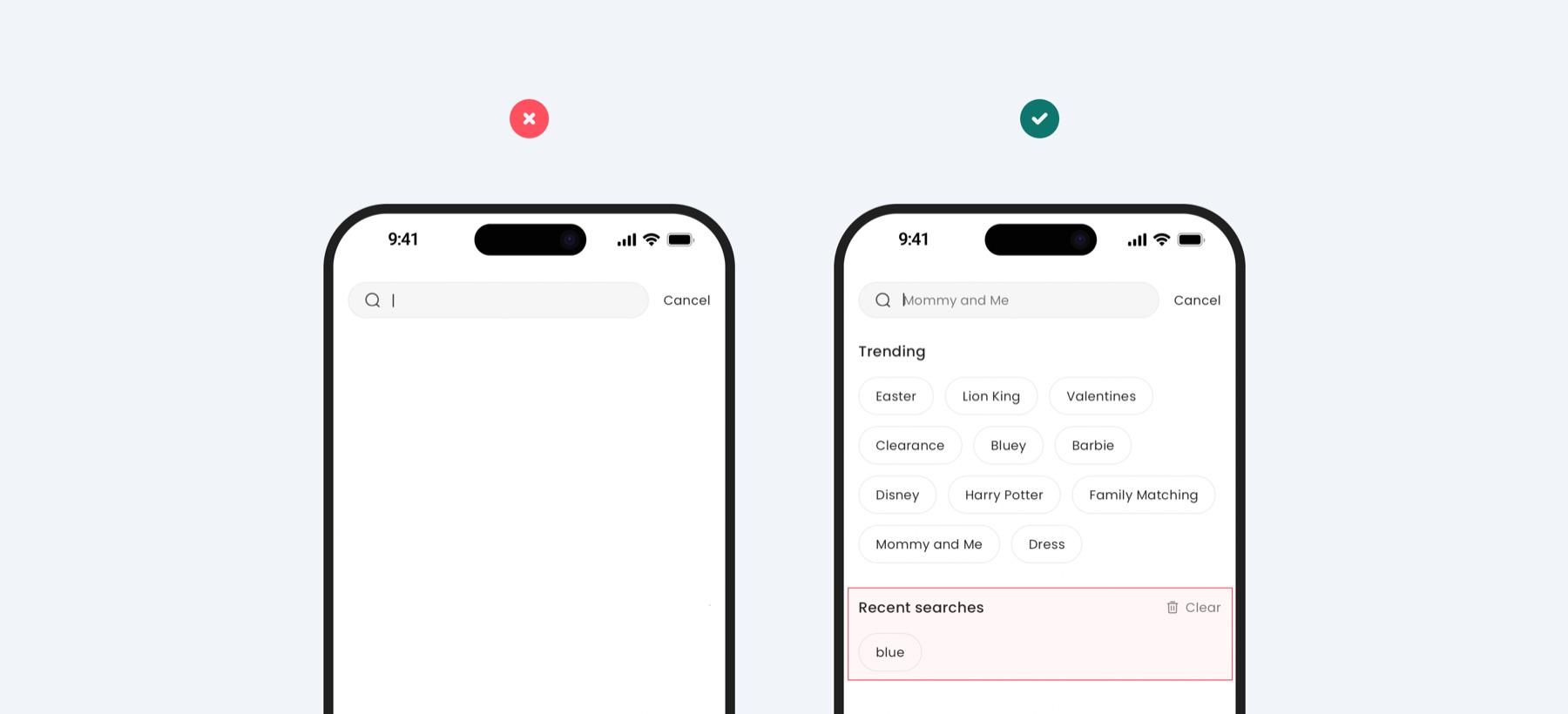
Recent search queries
Recent search queries have been introduced to help users quickly revisit previous searches without retyping, enhancing convenience and encouraging repeated engagement with the search feature.
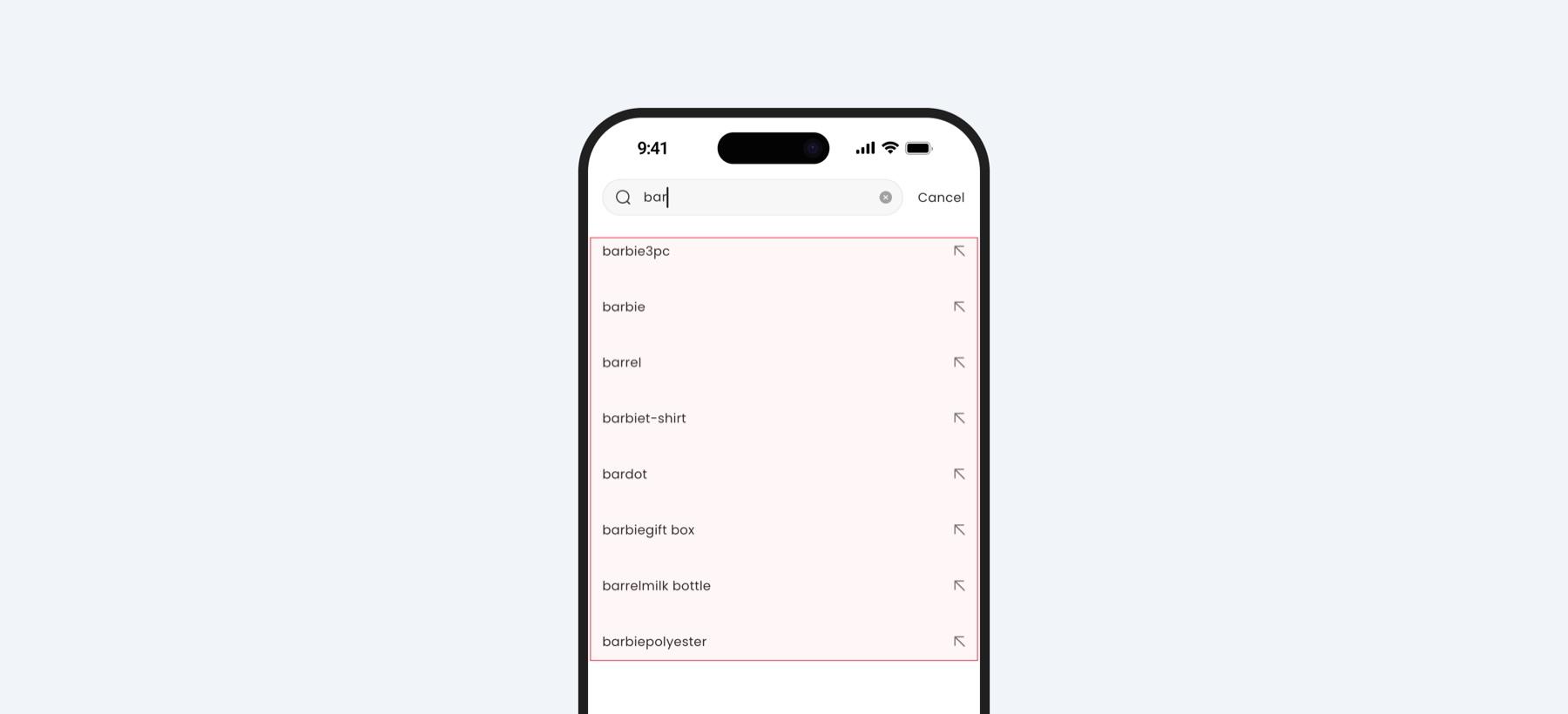
Autosuggestions
An autosuggest feature has been implemented to provide relevant suggestions as users type, helping them find items faster and stay focused on their intent.
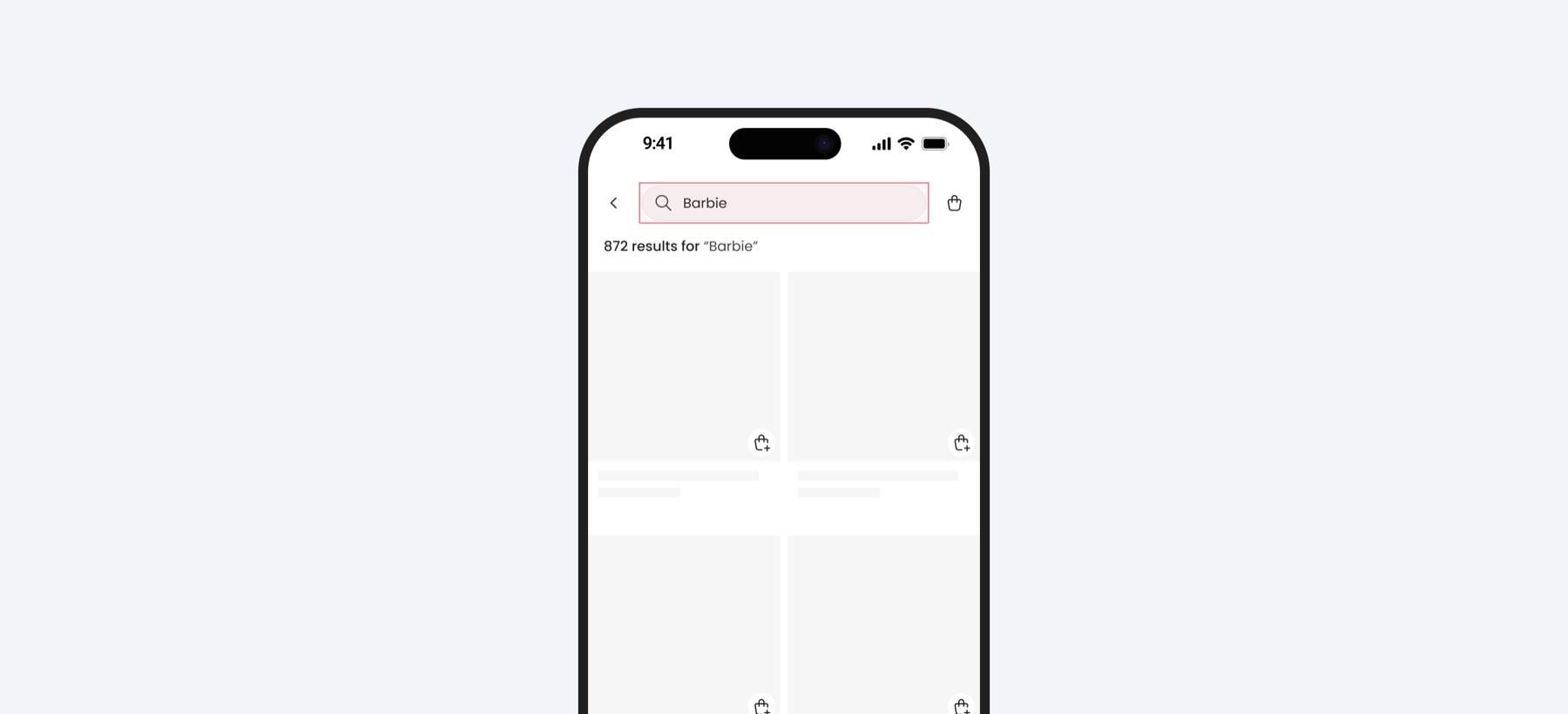
Preserving search queries
The search input now remains visible in the search bar after submission, letting users refine their search without needing to retype their query from scratch.
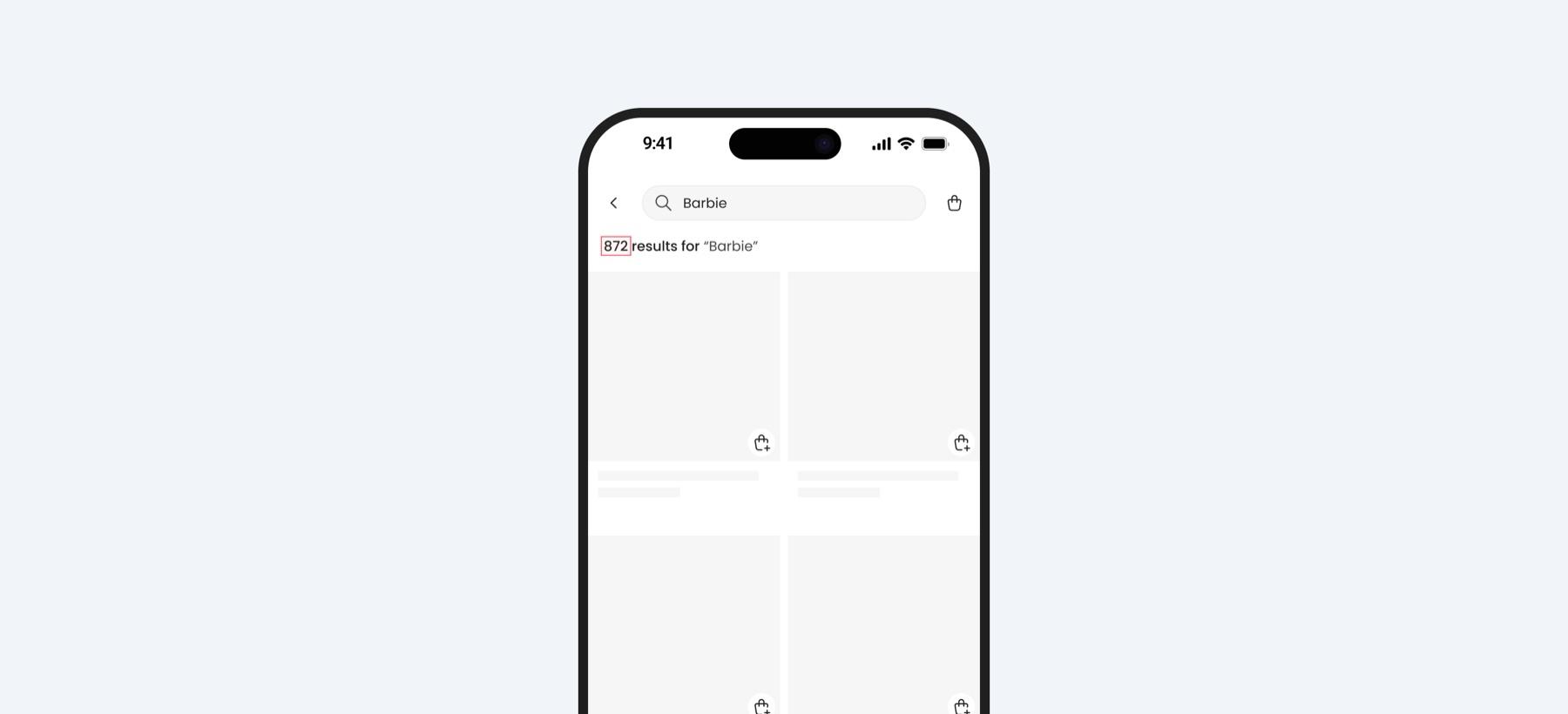
Search result count
The total number of matching results is now displayed, helping users gauge the effort needed to browse through available options and make informed decisions.
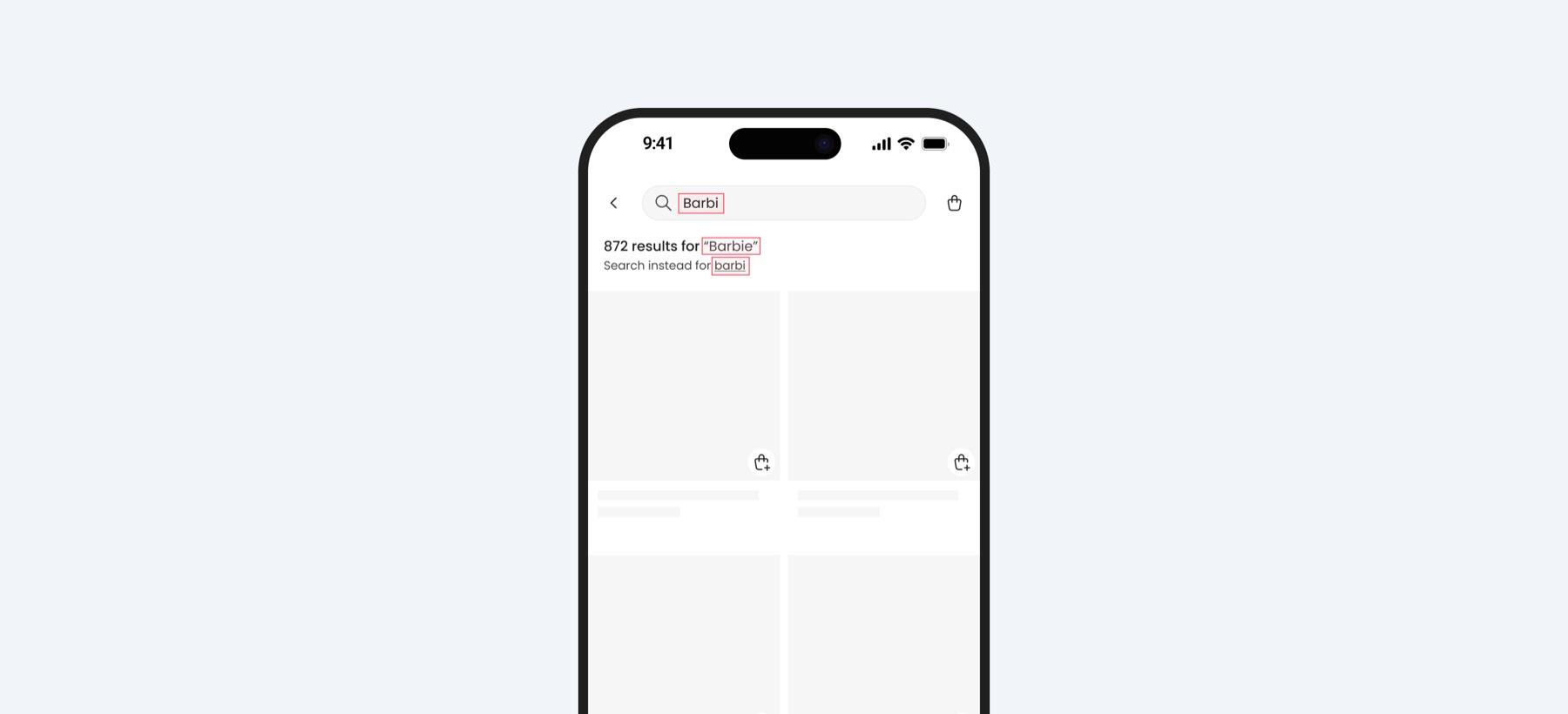
Spell correction
Typo detection and correction have been implemented to help users find relevant products even if they enter incorrect search terms, ensuring a smoother search experience.
No results page
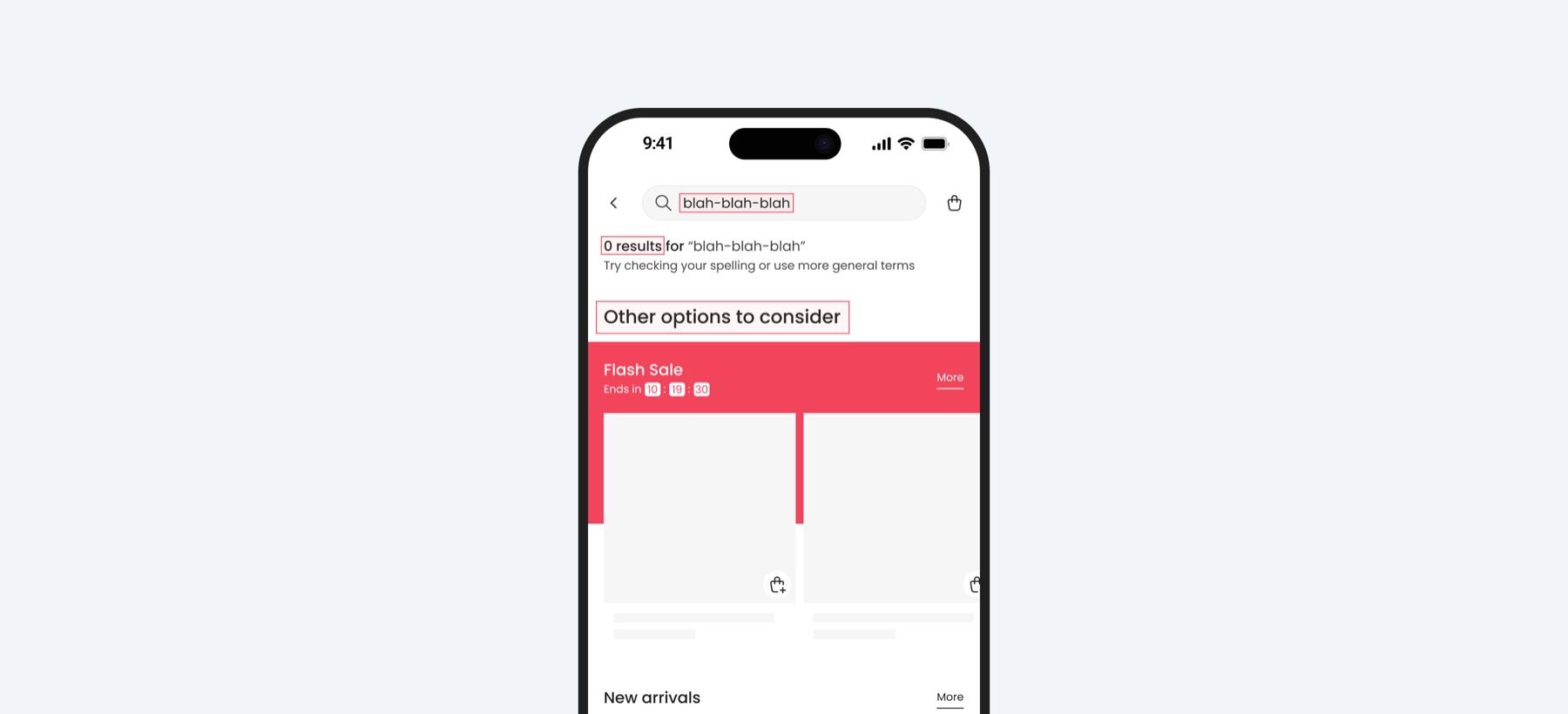
The "no results" page has been enhanced with an "Other options to consider" section featuring flash sales, new arrivals, and trending items, helping users explore relevant products even when their initial search doesn't yield exact matches.
Accurate & relevant results
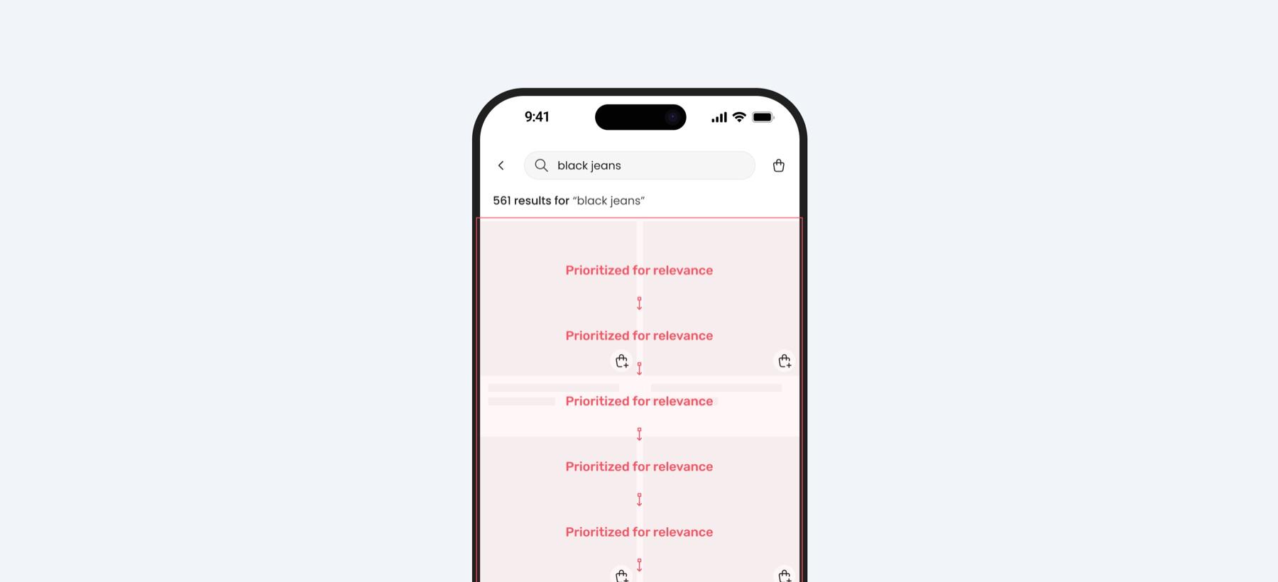
Search relevancy was significantly improved by refining the ranking algorithm to weigh multiple parameters, so the most relevant items appear first. For a search like "black jeans," results are ranked by exact match, popularity, ratings, and availability, in that order, so in-stock, well-reviewed, frequently bought items surface ahead of the rest.
Results04
Measured outcomes
38%
Increased user retention on mobile
Following the search experience improvements, only 38% of users exited the app within the first two minutes, indicating a significant reduction in frustration and improved content discoverability.
52%
Higher search engagement
Search usage increased to 52%, showing that users found the feature more accessible and intuitive, leading to greater adoption and interaction.
24%
Reduced search drop-off
Search drop-off decreased to 24%, demonstrating improved trust in the search results and better alignment with user expectations.
Key takeaways
This project reinforced the importance of a user-centered, data-driven approach to improving search functionality. Combining qualitative feedback with quantitative data, collaborating across teams, and benchmarking industry best practices led to meaningful improvements. Close teamwork between design, product, and engineering ensured feasible and impactful solutions. Some features, like filters and sorting, were deferred for future implementation, a reminder to focus on high-impact improvements first. And using research insights to guide decisions led to measurable gains in engagement and satisfaction, proof that data-driven design works.
Thank you for scrolling all the way!